Sharing is caring!
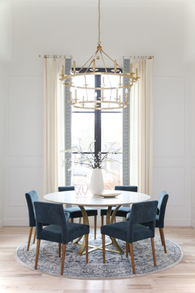
We’re back with another amazing project reveal to share with you all! My goal during 2021 has been to share all of the stunning projects we’ve been working on. Today I get to show you our very own Miller house breakfast nook redesign! It’s another COVID project completed and I can’t wait to get into all of the juicy details!
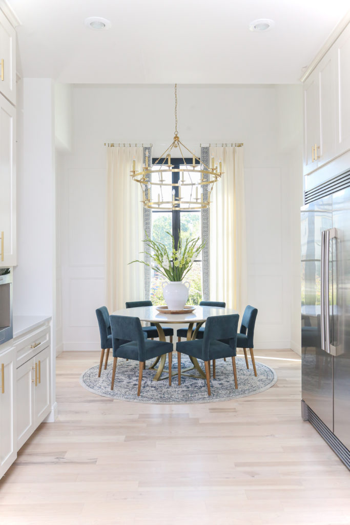
As I’ve said in my blogs before, a designer’s house is never really finished! We tackled the boy’s room and our living room within the last year. Our breakfast nook was another part of the house that I thought we could freshen up during lockdown. I wanted to keep this project light and simple! I incorporated all of my favorite elements to create a space where we can all be together.
The Walls
In order to make this room bright without losing the drama, we went with a gorgeous molding!
An easy way to add interest to the nook walls without breaking the budget or adding a lot of work was a simple Picture Frame detail. Smooth wall texture makes this a breeze and it was simple to caulk and paint the 1-1/4 molding to match the existing wall color. It is an amazing detail that adds dimension to the room! Once that was placed, we painted it a high gloss white. I love how it helps visually separate the breakfast nook from the kitchen. It looks so fresh!
The Drapes
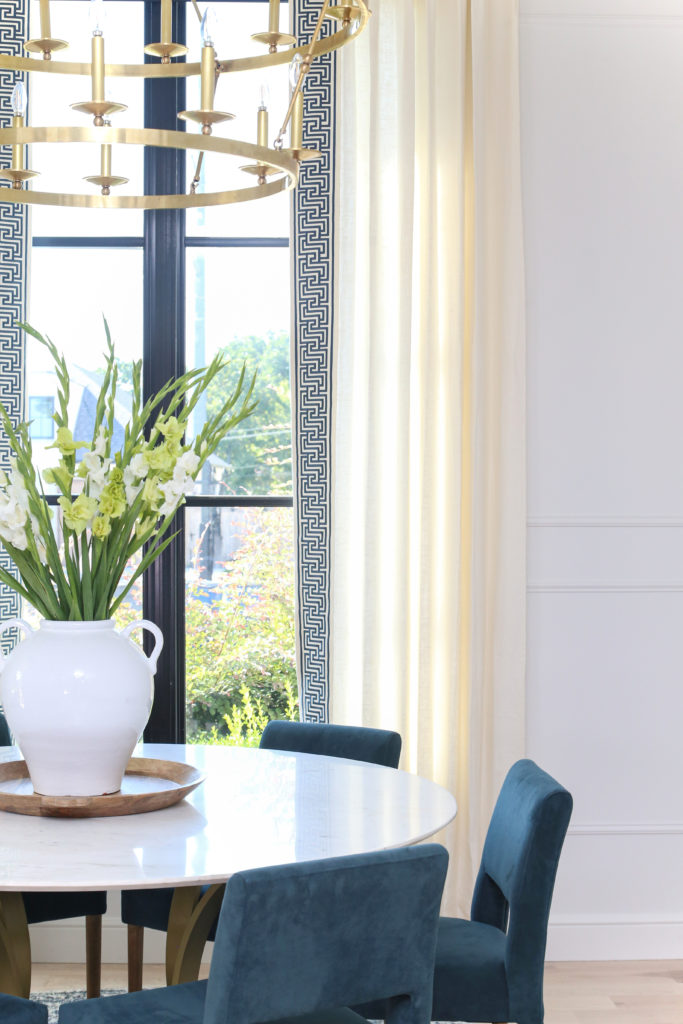
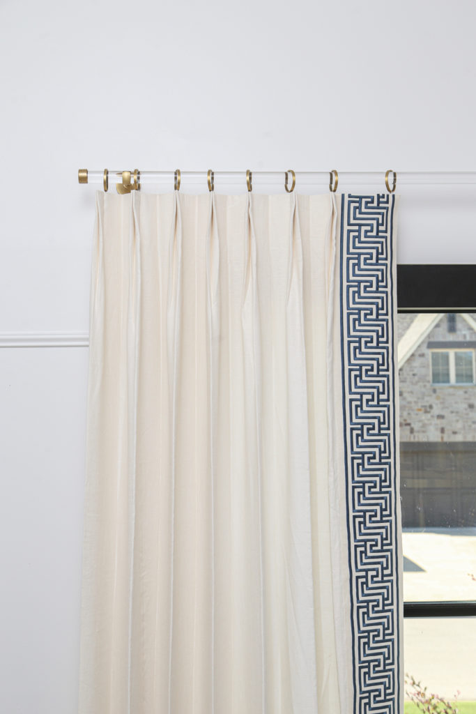
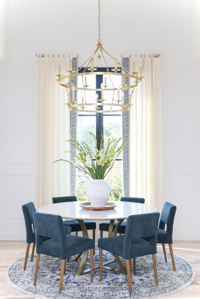
These beautiful drapes are another amazing collaboration with Drapery Nation! I was so excited to be able to work with them again after getting the drapes for Cohen’s room. The Schumacher tape used on the edge really pops on the white walls! And of course, I used gold hardware! It ties the drapes in with the other details in my home, and I am in love!
SHOP OUR FAVORITES VASES AND CUPS:

The Lighting
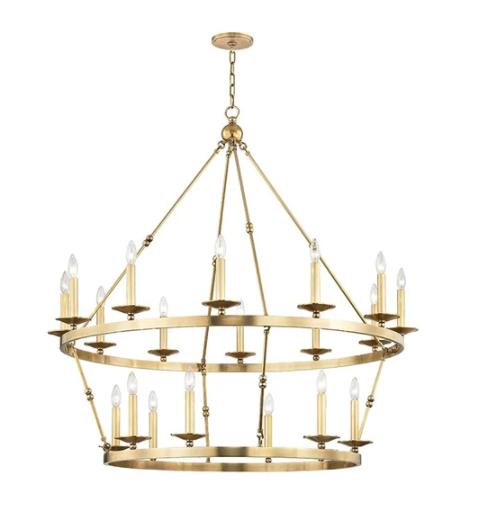
You all know that I love gold and brass accents! So why wouldn’t I use this amazing brass Allendale chandelier from CC+Mike: the Shop? It is the perfect mix of grand and simple! This chandelier design is a beautiful shape that will continue to get compliments for years to come. It is perfect for our round breakfast nook. Love!
The Table and Chairs
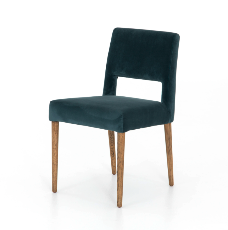
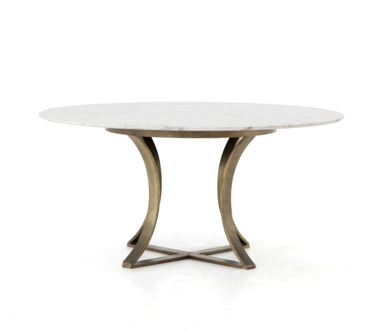
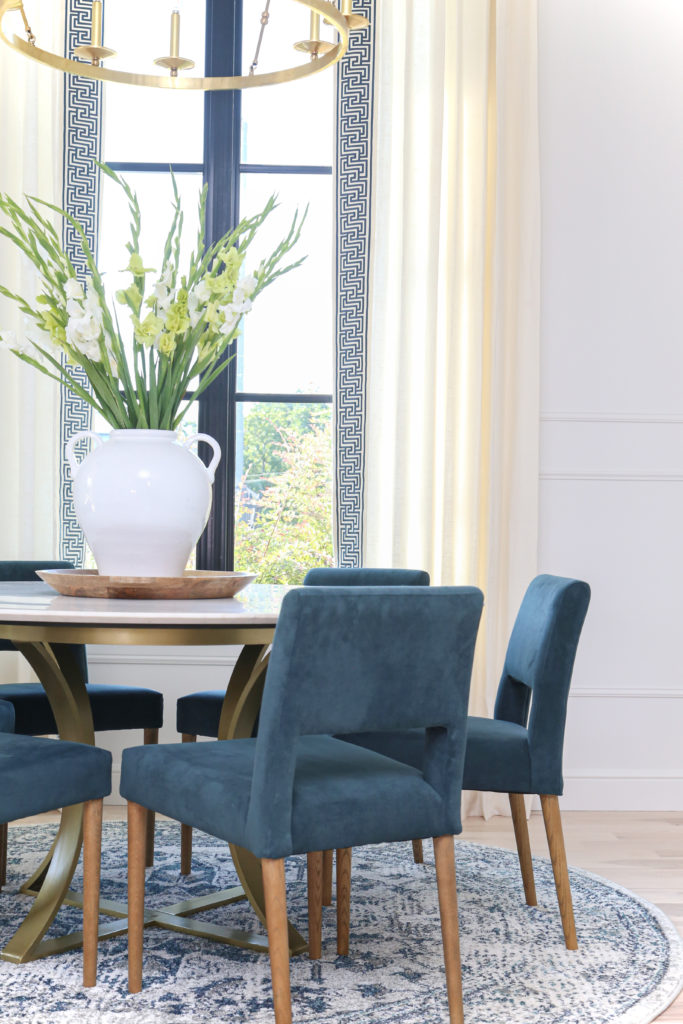
As I said, I wanted to combine all of my favorite elements in this design. This includes marble and jewel tones! They came together to make my dream breakfast nook. The Gage polished marble dining table is absolutely stunning! It is the perfect balance of modern shapes and luxury materials. I love how it feels geometric while keeping the antique charm. And we can’t forget the chairs! The Joseph dining chairs feel so rich next to the clean marble of the table. They add a touch of warmth to the room with styled emerald velvet. This table and chair combination was a match made in heaven!
The Rugs
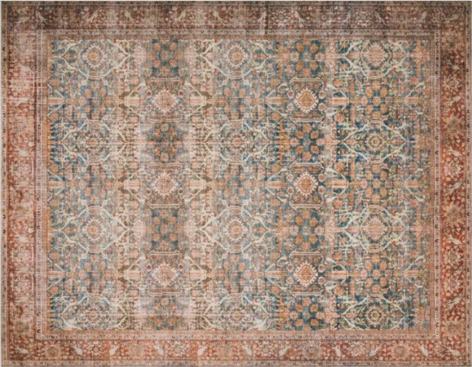
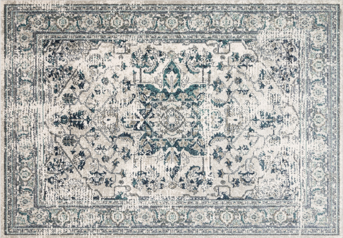
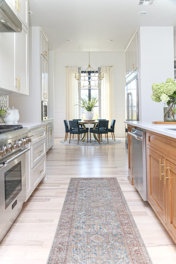
I am so proud of our rug collection in the CC+Mike: the Shop. I’m sure you’ve seen them in some of our past posts, and we used one of my favorites in our breakfast nook! The round light blue-green Joaquin rug plays off the colors in the room so well! The traditional medallion motif brings a beautiful lived-in feel to this space. And it’s pretty much spillproof! We also used the Layla runner in our kitchen to draw the eye through and into the breakfast nook. Check out our full list of favorite rugs for 2021!
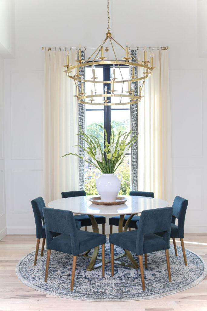
It was a joy to work in this room! All it took was changing small but significant details to really make it shine. This breakfast nook is now the perfect place to sit with a cup of coffee and get ready for the day. I am so glad I got to share this reveal with you! Stay tuned for more of our project reveals. I can’t wait to show you all the plans I have in store for the Miller house!
