Sharing is caring!
When our clients that hired us to do THE SPORTS ARMORY called and were asking us to do a kitchen remodel and furnish some rooms for them, we immediately jumped at the chance to work with them again. They live in a gorgeous, I mean gorgeous home in South Tulsa that sits on a lot overlooking trees and a lake that gives you serious Colorado vibes. Their house is amazing – high end finishes everywhere and a view that is to die for, trust me on this one. BUT, it definitely was time for a little kitchen update (you will see what I mean when you see the before photos below) mainly because of an outdated island layout and the simple fact that the kitchen wasn’t functioning well for the family living in the home.
OH AND BY THE WAY THIS GORGEOUS HOME IS NOW ON THE MARKET. If you’re looking for a home in South Tulsa with a kick @$$ kitchen that makes you feel like you’re in Colorado, this is the home for you.
The Kitchen – BEFORE
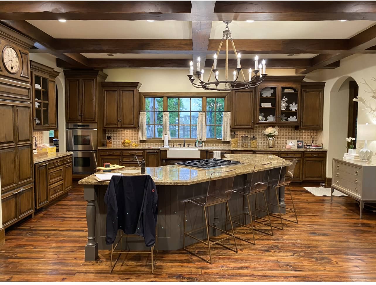
This kitchen was an incredibly warm and welcoming space, but with all of the wood accents and dark features, the owners were looking for a refresh to bring some brightness back to the room. Our plan was to keep the beautiful stained floors and the back wall of cabinets, but reorganize the room to make it brighter and more functional by painting the cabinets, updating the island design, and adding new countertops, lighting, hardware, faucets, and appliances. The updated two vertical kitchen islands by Woodstock Cabinets was the cornerstone of the design.
DRUMROLL PLEASE FOR THE AFTER……
AFTER – FRENCHMAN’S CREEK REMODEL
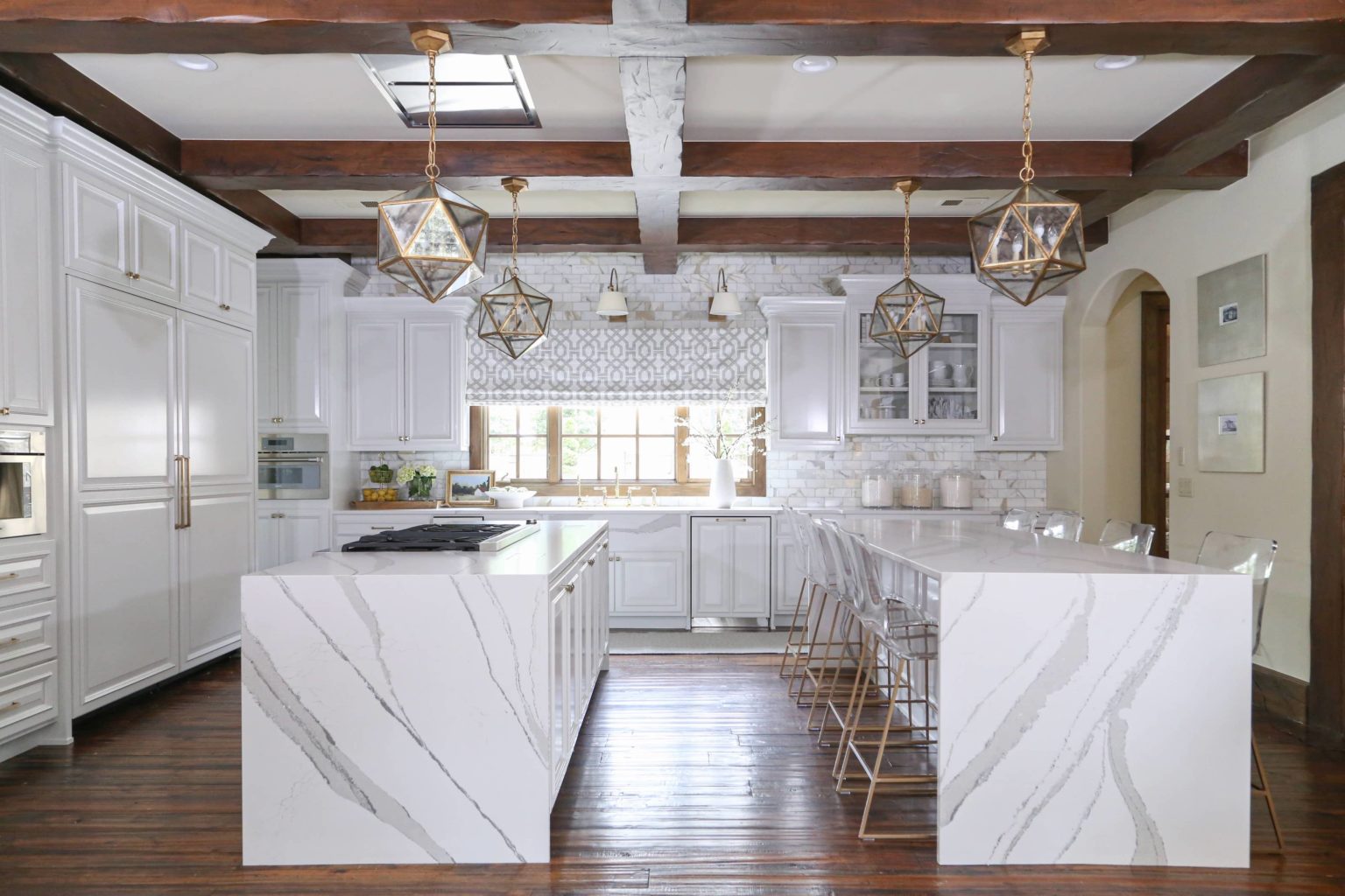
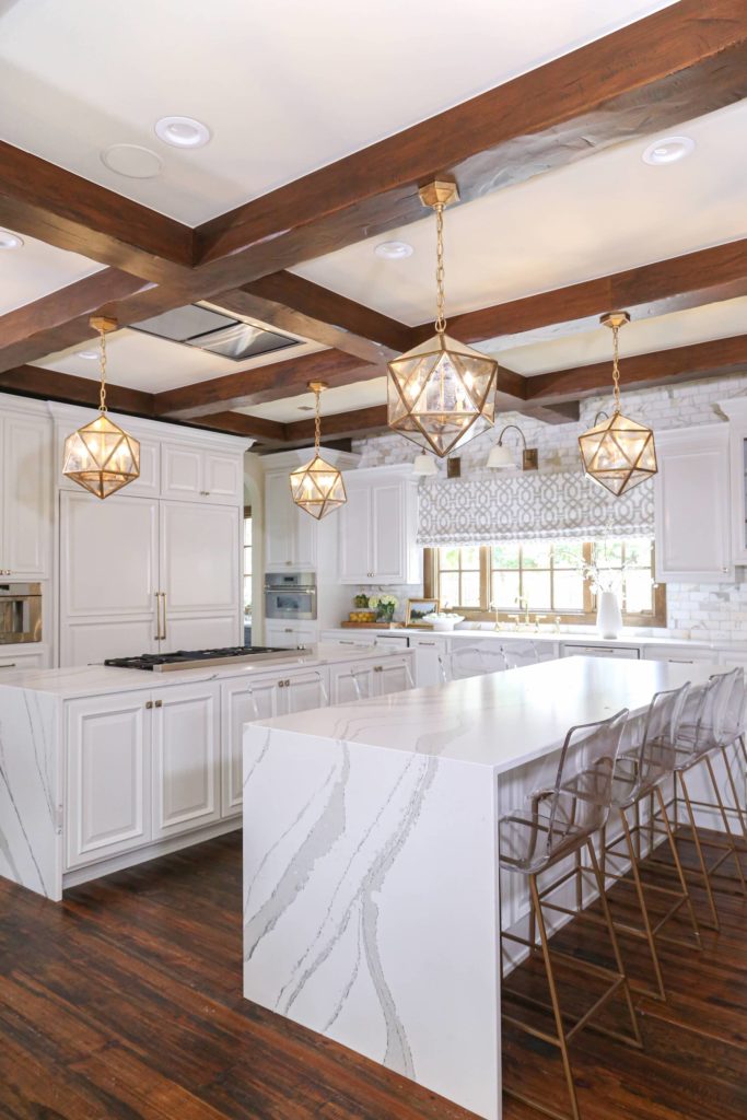
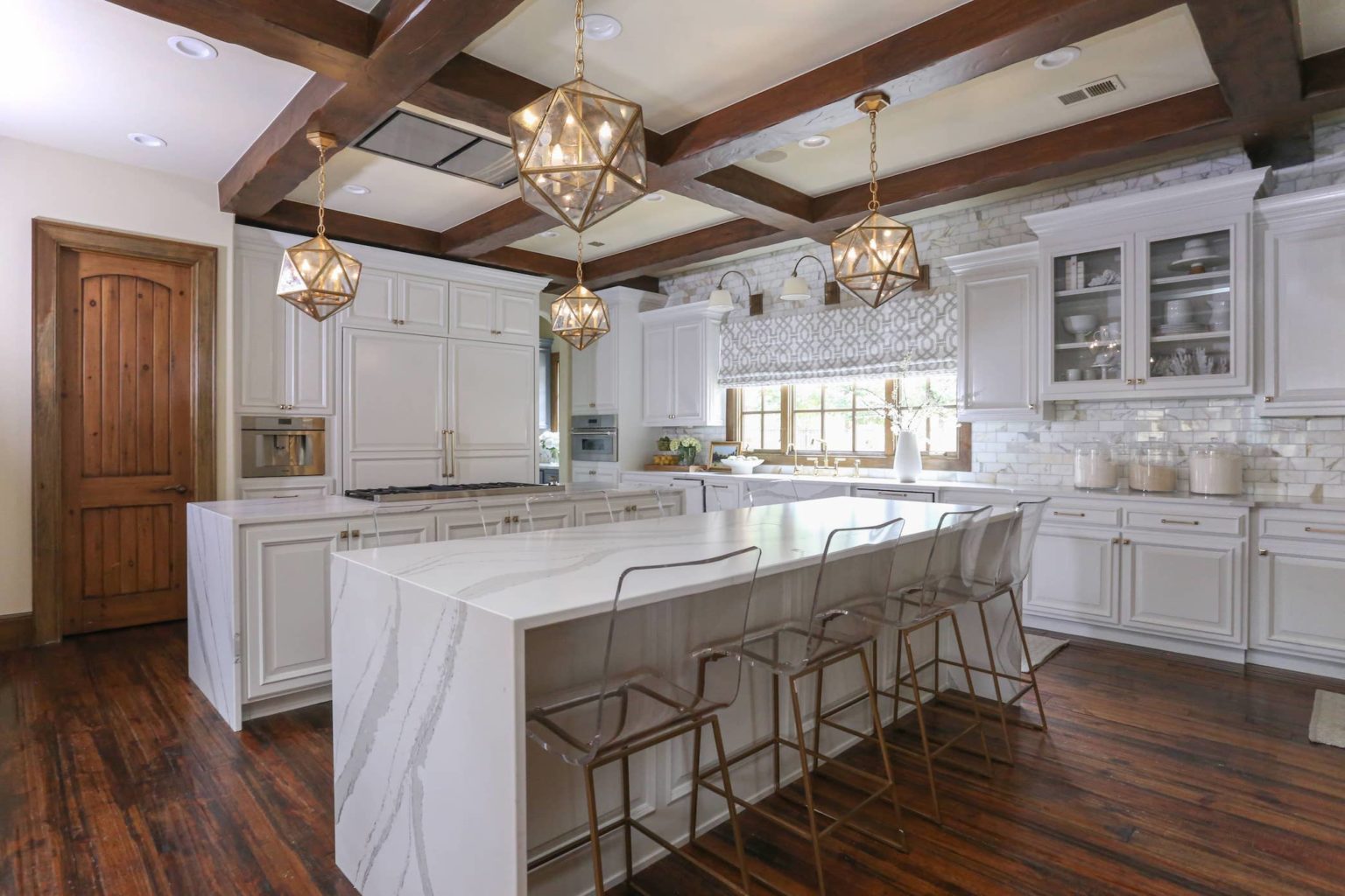
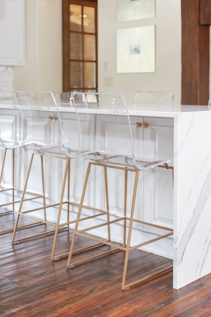
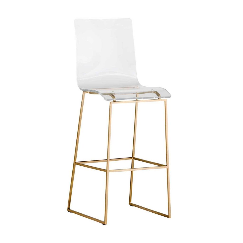
So as you see, this looks like an entirely different kitchen from a design and function standpoint. The island shape in the before was definitely dated and in need of a 2021 refresh and let me tell you, this two island concept is totally trending for kitchen design! I LOVE how functional the two island concept is — allowing for eight, yes I said EIGHT bar stools for people to sit around, functioning almost like a table in the kitchen. Then the other island is in perfect position to pull things out of the fridge and set them on the countertop for cooking. The overall end result…a gorgeous kitchen redesign without gutting the entire kitchen, therefore, what I like to call a kitchen refresh!
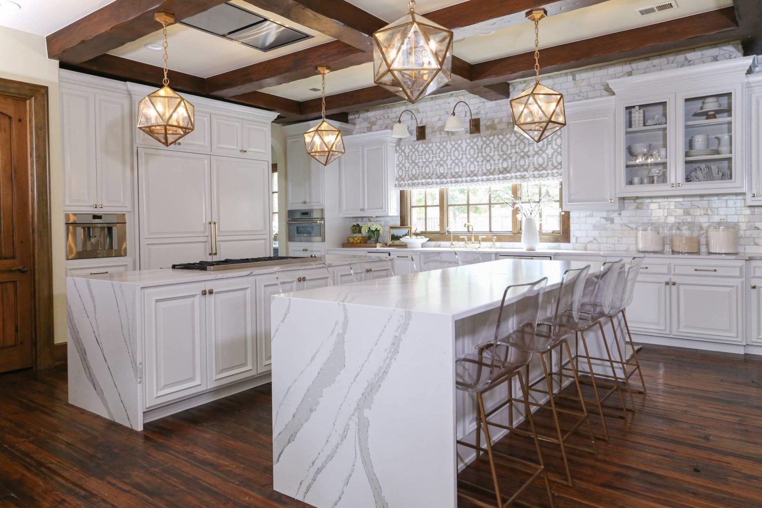
SCROLL AND TAP TO SHOP THE FRENCHMAN CREEK REMODEL PRODUCTS:

One of my biggest challenges when designing this kitchen, was giving the kitchen a fresh new look while still staying true to the original design style and architecture of the home. It has almost a European feel with gorgeous woodwork all throughout the home — wood beams, wood trim, wood windows. It truly is a masterpiece and we decided right away it would be a shame to start messing with all the pre-existing, beautiful natural wood. So, we left all of the wood doors, wood trim, and wood beams as is and worked with the original design of the home when planning our kitchen updates. Choosing the cabinet paint color was very important — believe it or not it is actually CLASSIC GRAY by Benjamin Moore that we selected — but with the pre-existing wall color which is warm and all of the wood beams and trim, the color looks more white in this home. If we would have gone with a true white on the cabinets it would have been blindingly STARK WHITE, you guys. So pro tip: if you are working with a darker home with darker paint colors on the wall, don’t go with a stark white paint color on your cabinets. Why? IT WILL BE TOO BRIGHT. You need to do an off white (like PALE OAK that we used in the bathroom below or a light gray like we used in this kitchen) and the end result will look white without being stark, blindingly white if that makes sense.
Frenchman’s Creek Kitchen Rendering
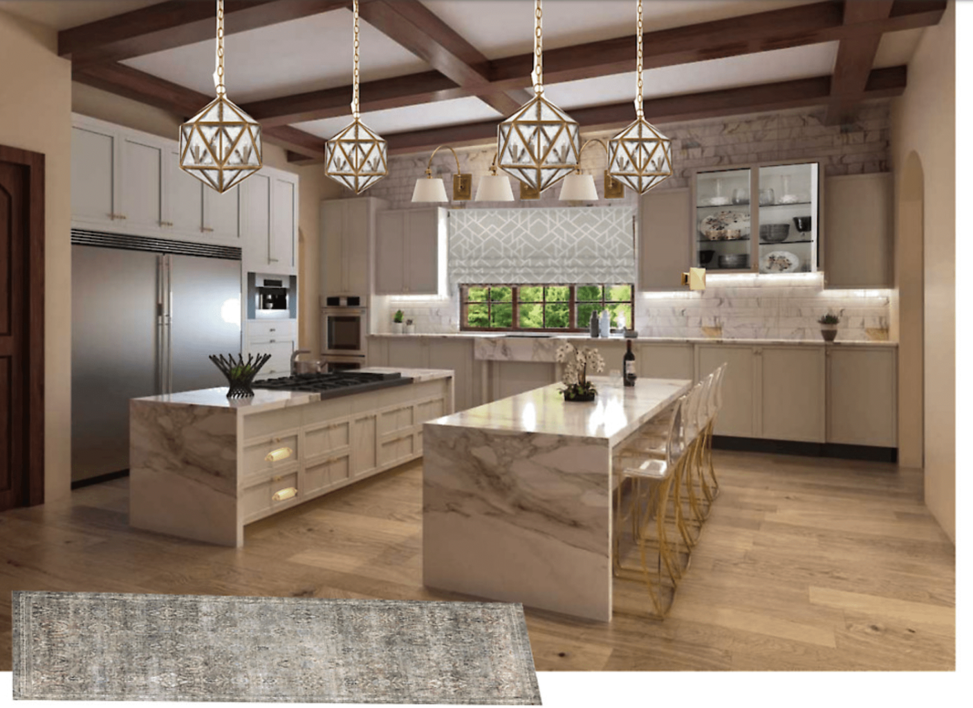
When I take on remodels like this where we are making major changes to a space, I love to use 3D renderings to show the client what it will look like when we are all finished with the project! It’s so amazing to see the transformation from design to completion. This kitchen turned out almost exactly like our original rendering. I think it’s so cool to show you guys how we work with clients to present these incredibly detailed renderings to show them what their actual kitchen is going to look like when we are all done!
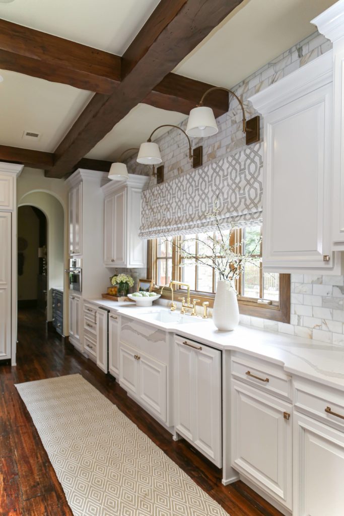
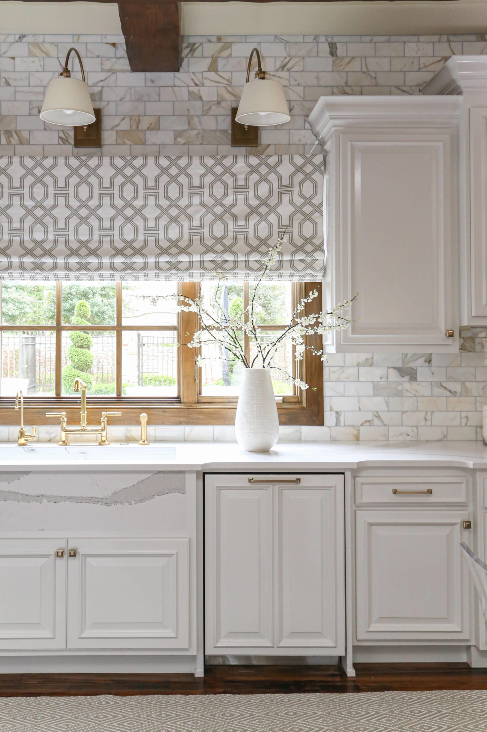
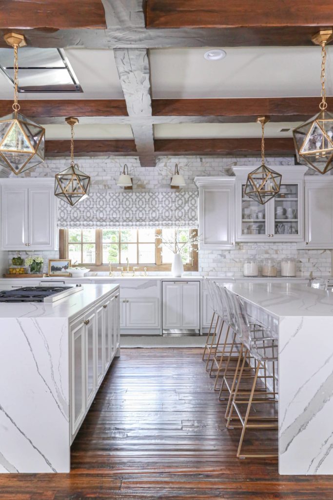
One of my favorite things about this kitchen has to be the Cambria countertops. They completely transform the kitchen from the dark and dated countertops that were previously in the kitchen. The backsplash is also to die for – It’s a Calcutta Marble backsplash that has your classic gray tones that always come in marble, but also pulls in some warm, gold tones as well. The marble backsplash was key to pulling in the pre-existing wood beams, trim, and wall color with the new additions! The gorgeous brass light fixtures also help with tying everything together.
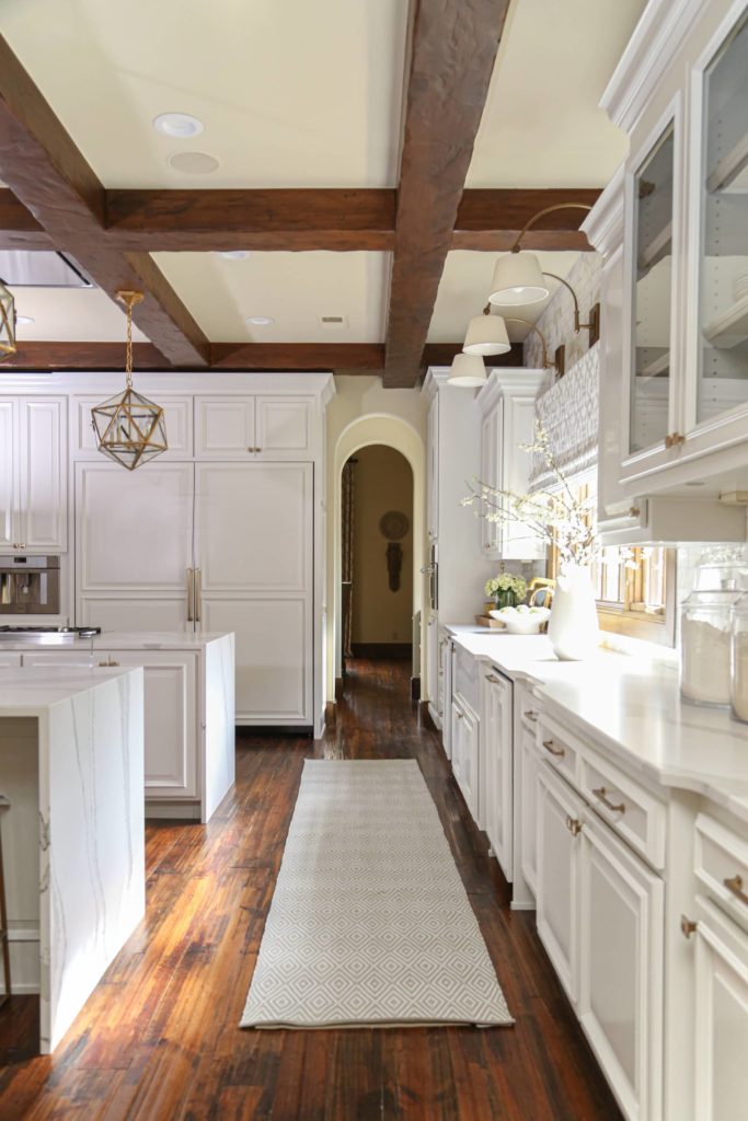
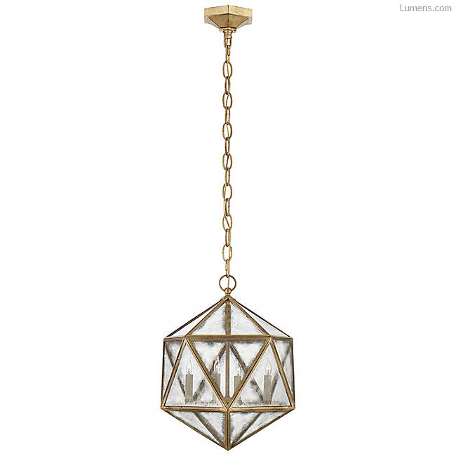
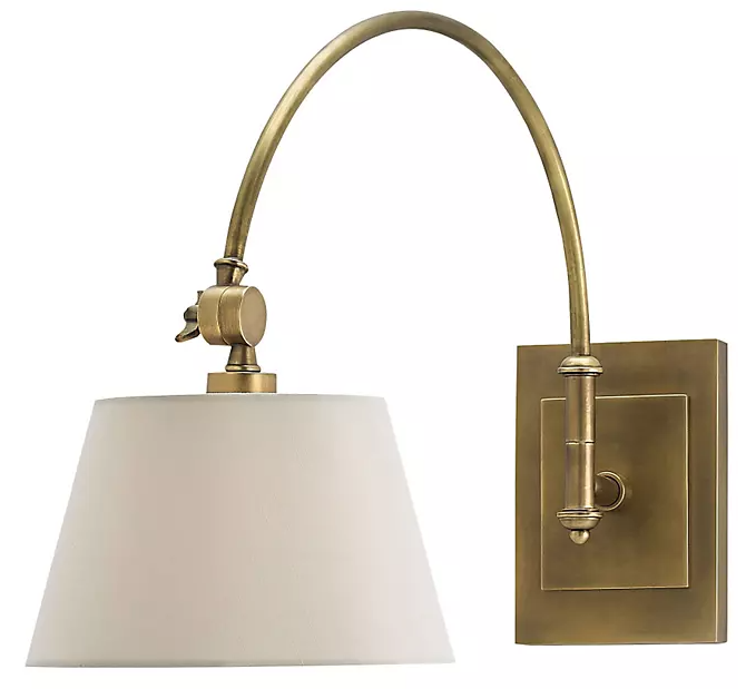
The geometric pendants above the islands were one of my favorite things to select for this home you guys! Let me tell you we looked at hundreds of pendants and these were the ones I had my eye set on. Thankfully, our clients trusted us and went for it instead of playing it safe and I’m telling you, these beauties are absolute show stoppers! I also adore the Ashby sconces that we placed above the window.

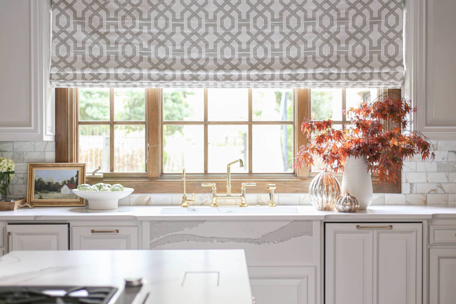
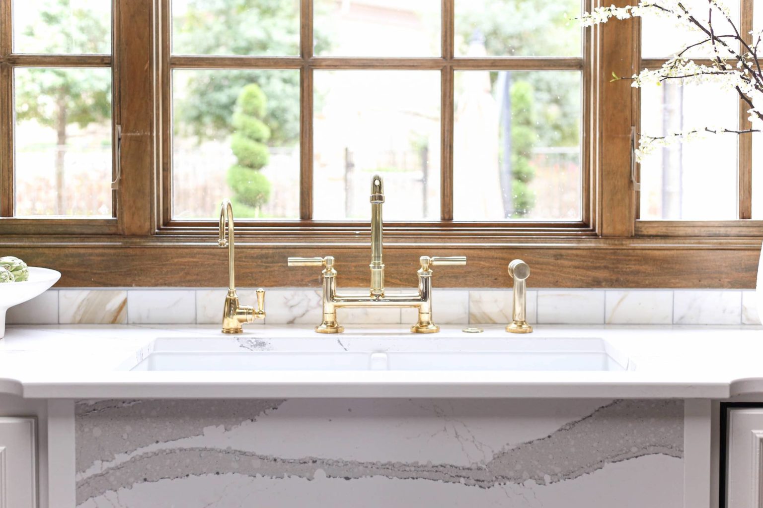
Let’s Talk About this Bridge Faucet!
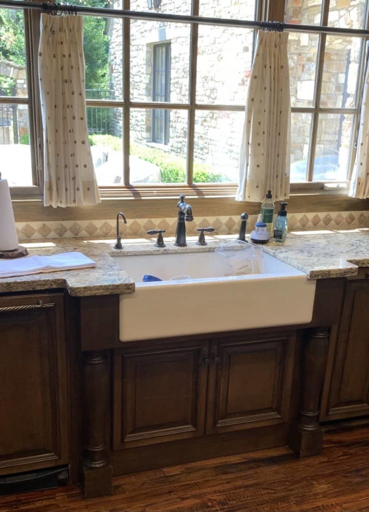
Before this renovation, the clients had a beautiful farmhouse sink, but they were in the mood for something new. We created a two-bowl apron sink with the CAMBRIA QUARTZ countertops as the front face of the sink to replace it and chose this absolutely stunning Kallista unlaquered brass bridge faucet. The gold accents tie in so well with the light fixtures and Menlo drawer pulls!
THE BATHROOM – BEFORE
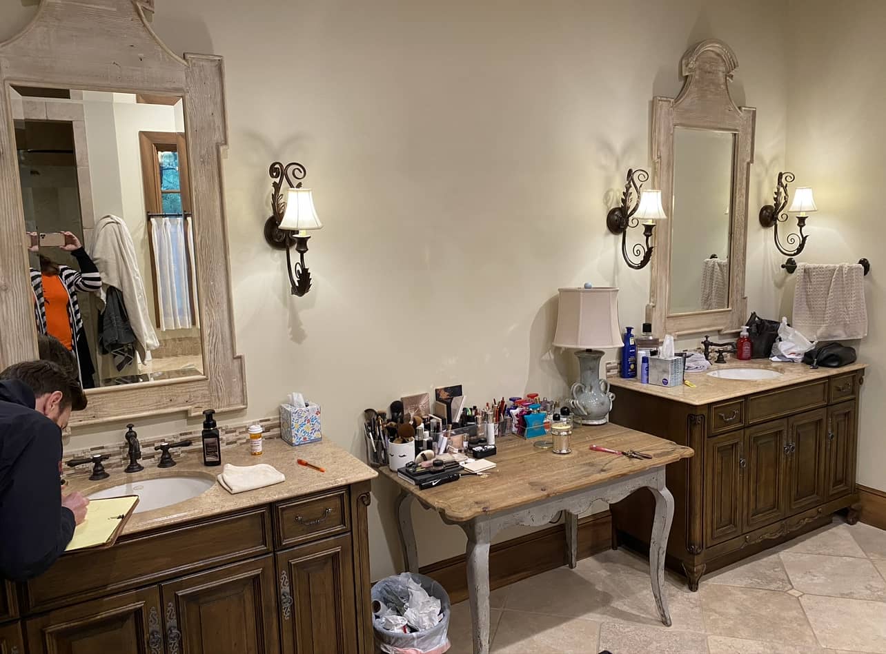
The bathroom was also in need of a refresh so we decided to tackle that project at the same time we were doing the kitchen! This bathroom just wasn’t functioning well for our clients from a storage perspective (you can see why in the photo above), so again, we partnered with Woodstock Cabinets to create a beautiful new bathroom full of cabinets and storage for our clients.
Cabinet Color is Pale OAK, by Benjamin Moore
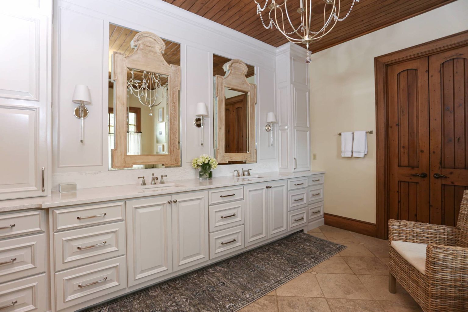
There was a lot of wasted space in the room before the refresh but the new cabinetry provided our clients with all the storage they could ever possibly what or need! We also brightened up the room with fresh finishes. We brought the sinks closer together and used the new space to create a new cabinet layout. Check out how we layered the old mirrors to make the wall more dynamic and also added a runner over the tumbled marble travertine floors.
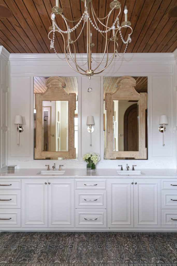
The chandelier we used in this bathroom was also integral for the overall redesign. Again, since we kept all the original wood treatments and stayed in line with the original architecture of the home, it needed to match the overall feel of the home. We chose a silver, crystal chandelier that pairs beautiful with the wood ceiling and wood mirrors we layered over the glass inset into the cabinetry.

The Boys Bedroom Re-do’s
Another fun part of the Frenchman’s Creek house was working in the boys’ bedrooms. There were two rooms that needed a refresh. I was ready to make the rooms fit the personality and interests of these teen boys — skiing and basketball! If you’ve been following CC+Mike for a while, you’ll know that I love to use mood boards to help visualize bedrooms. We created one for each of the rooms. Here is how they turned out!
The Ski Room
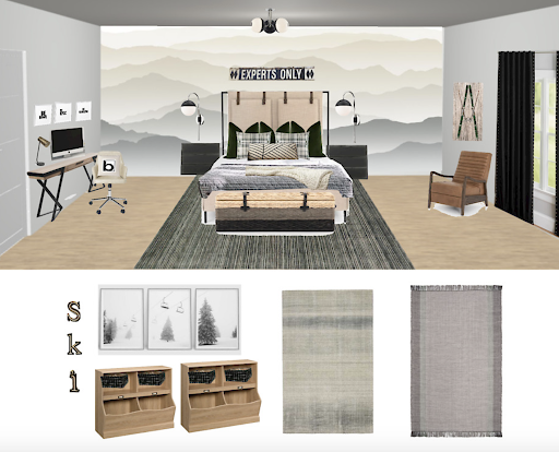
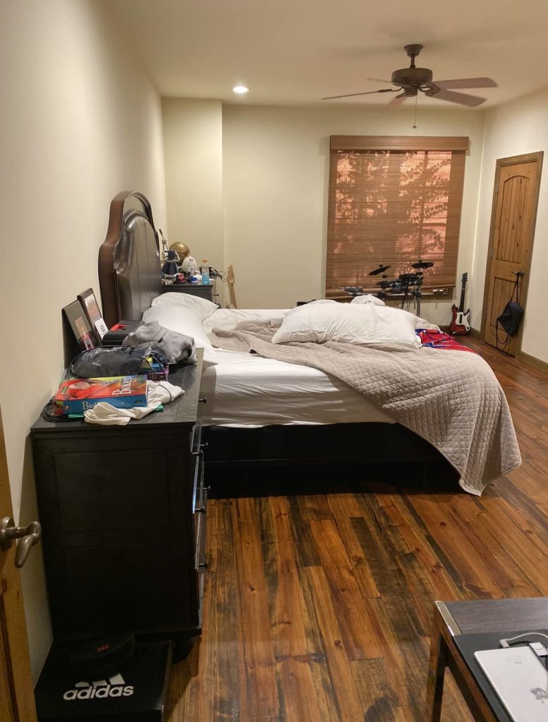
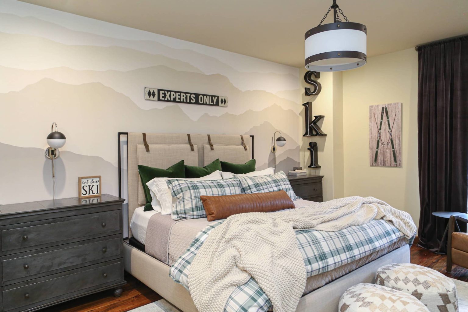
Again, I love showing you the before renderings and design plans so that you can see these projects go from design to completion! My favorite feature in this room is the wall mural. We wanted to bring the mountains indoors, and we did just that with this mural. Just like the bathroom, the space had a lot of untapped potentials. I knew that with the right layout and decor it would become the perfect cozy and cool bedroom.
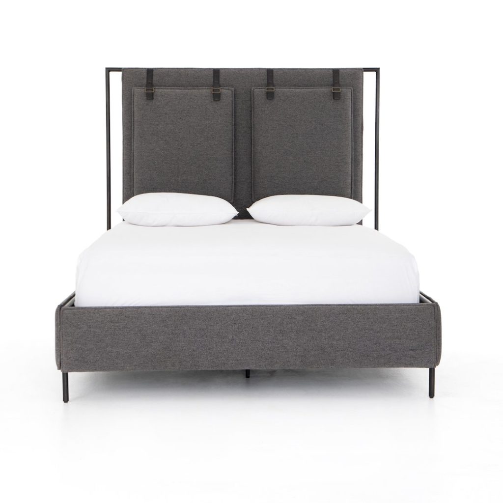
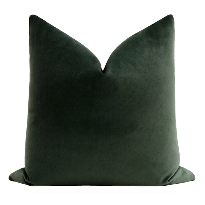
This room has several of my go-to design pieces from CC+Mike: the Shop. The Leigh upholstered bed is the perfect neutral frame that keeps the room cozy. We added a comfy pillow-scape with classic emerald velvet pillows from the shop. So fun!
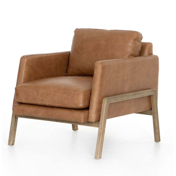
For extra storage, we brought in one of my favorite kids’ organizational pieces. These toy bins can work for much more than just toys. They are a fun and stylish way to help your kids organize! And what is a bedroom without a chair to lounge in? Here is a similar armchair that can fit in any room.
The Shiplap Room
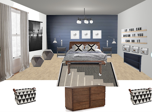
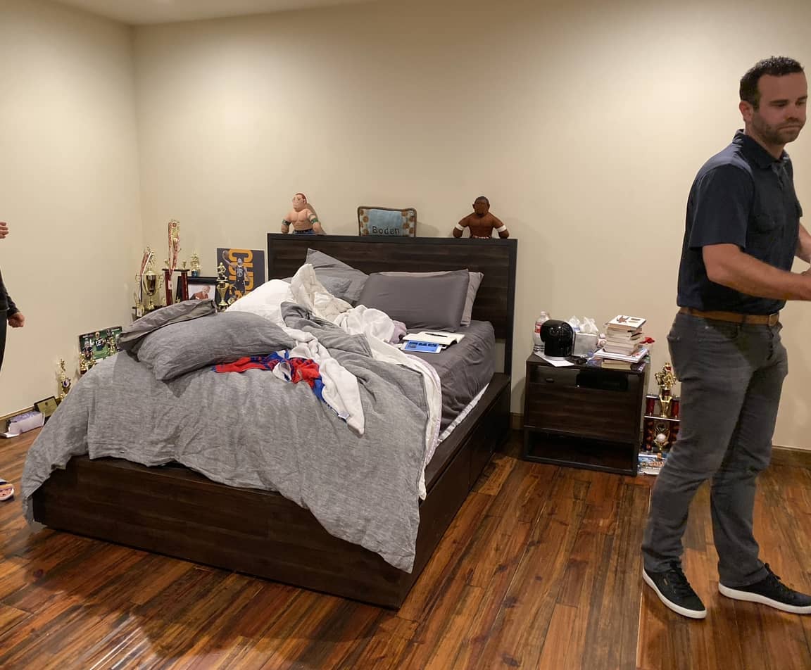
The second boys’ room was also bare-bones. With a light wall color and minimal furniture, it was missing the personality that makes kids’ rooms so fun to work on! A refresh was long overdue. But it didn’t stay that way for long.
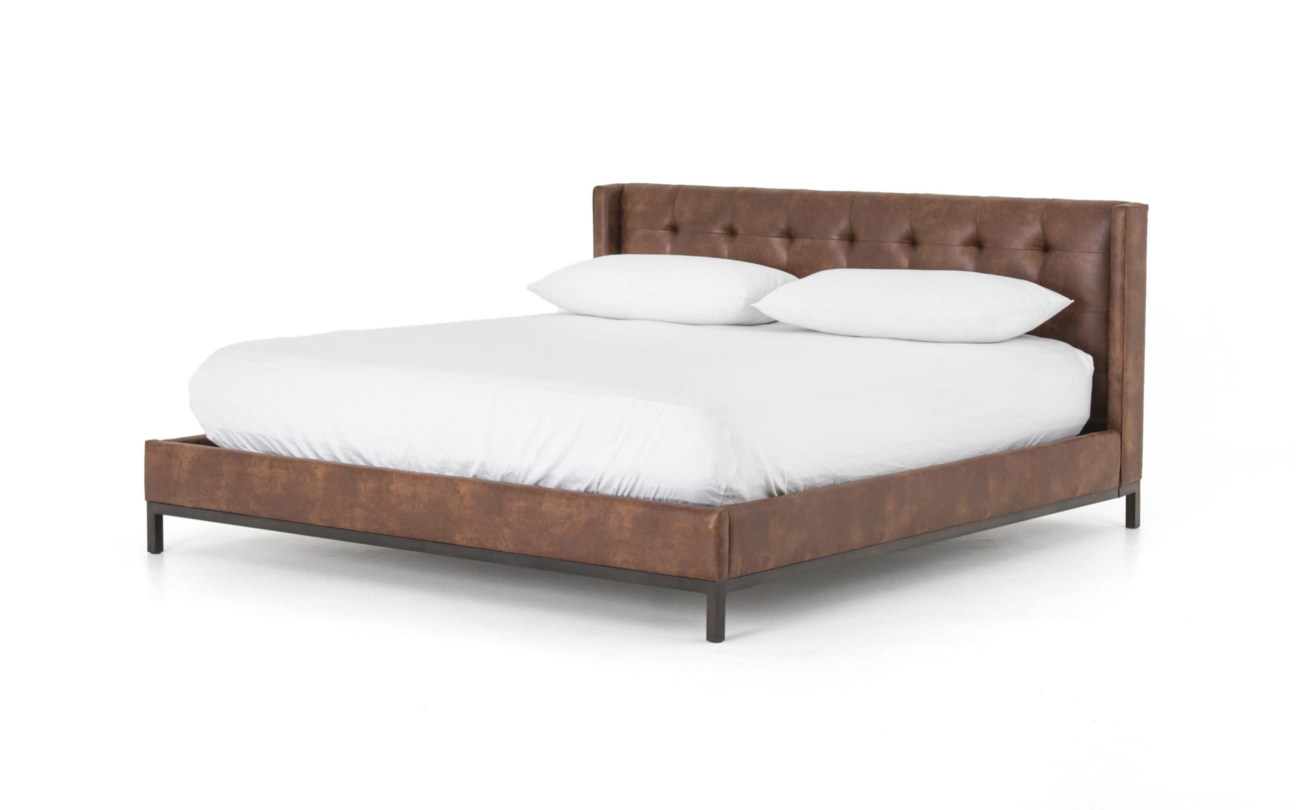
We created this stunning blue shiplap accent wall to give the room some drama. The Newhall bed, from CC+Mike: the Shop fits so perfectly with the floors! You can’t go wrong with the dark wood. So cozy!
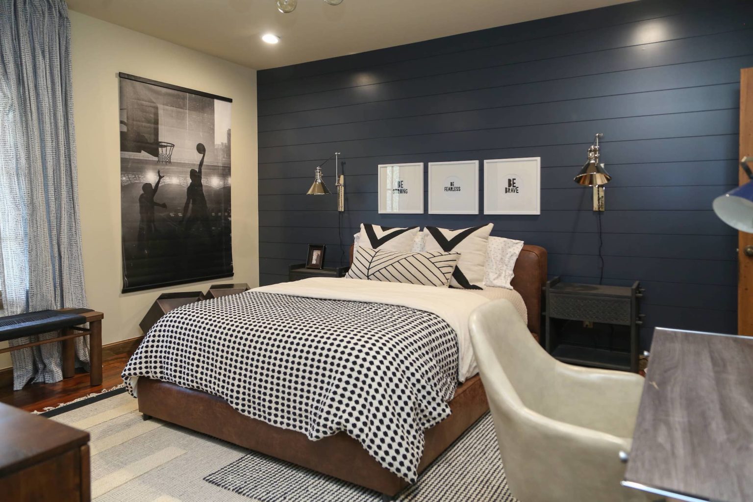
SCROLL AND TAP TO SHOP ACCESSORIES WE USED IN THiS BEDROOM, INCLUDING, the white circle mat Pottery Barn Frames, cb2 black dot bedding (I LOVE THIS bedding), cb2 pillows, and basketball art!

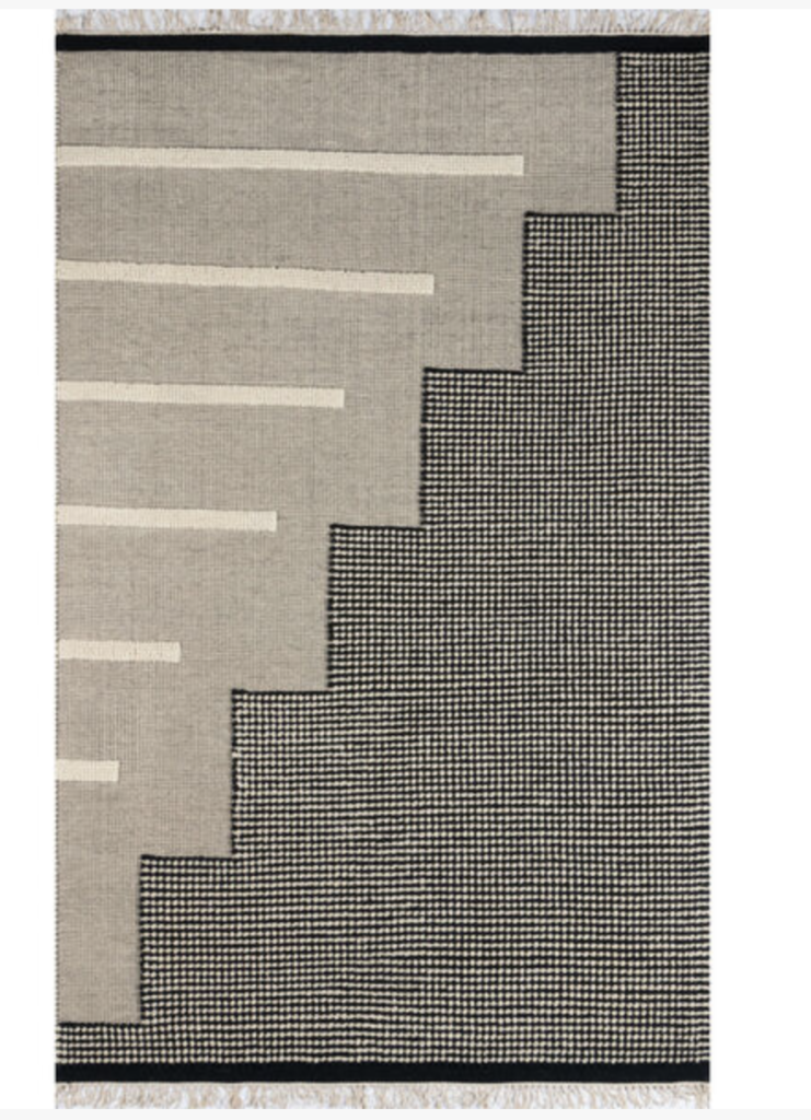
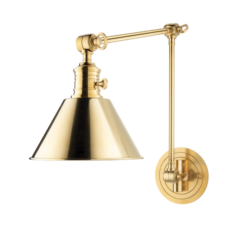
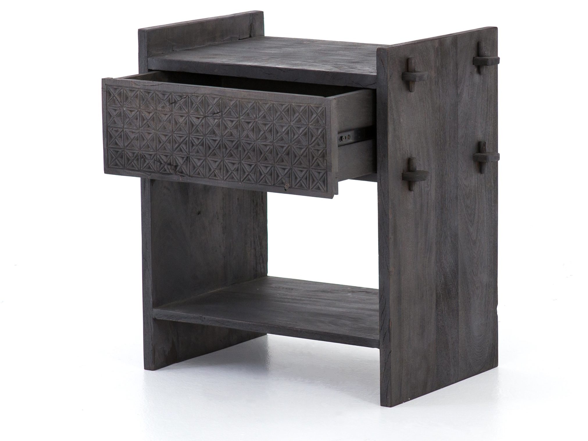
I love to use rugs in bedrooms to bring softness to the room. I chose this beautiful geometric rug. It’s a fun pop of the unexpected! After setting up the nightstands with the amazing Garden City sconces this room is ready to go.
The Game Room
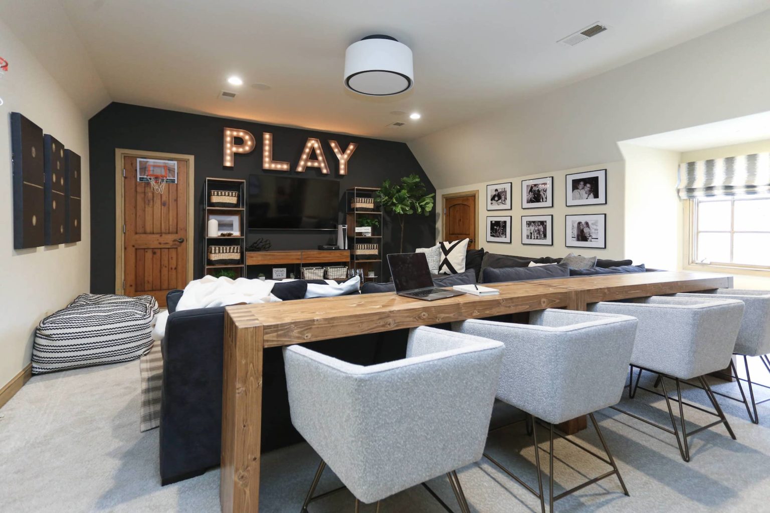
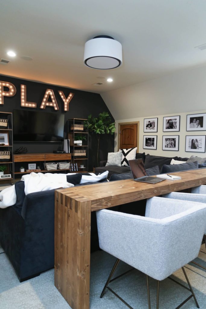
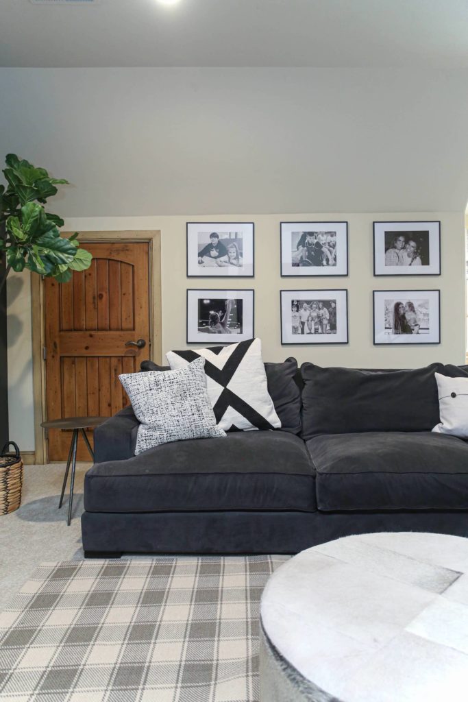
The last room we gave a refresh in the Frenchman’s Creek house was the game room. We wanted to create a space where the family could gather and… PLAY! The space is divided into two areas: the business side with a table and chairs for working on homework or playing board games; and the party side with a sectional and tv set up for hanging out. This space, just like the rest of the house, feels clean and modern but still inviting. So pretty!
If you want to shop some of the products we used to make this game room come together, you can SCROLL AND TAP ON THE PHOTO to shop.

Before
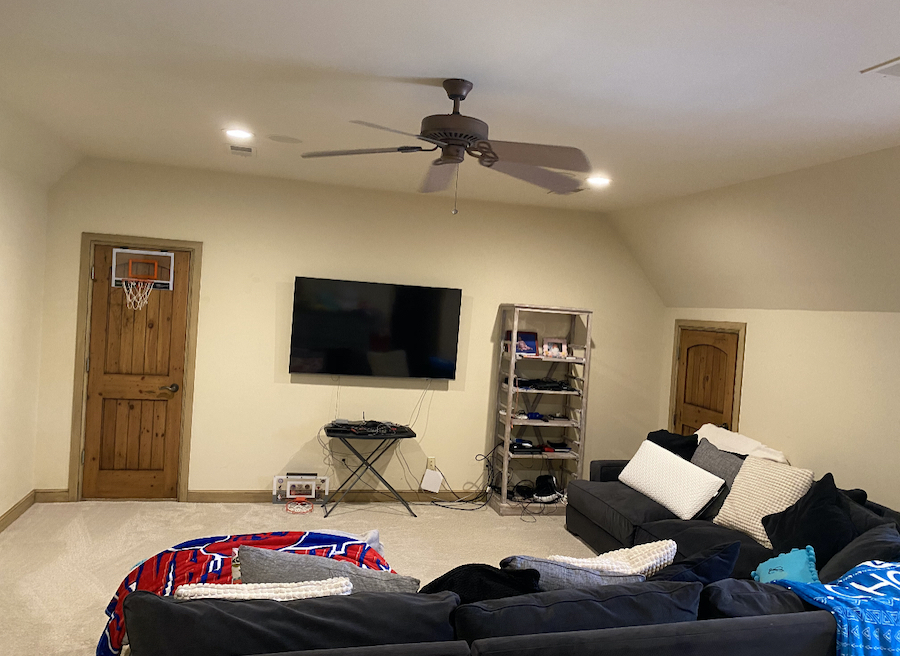
Great spatial planning and decor can completely transform a space, and this gameroom was no exception! We didn’t do any painting or structural work, but this space looks like a completely different room. Mike and I were so excited to see the end result of this one, and we love imagining all the fun that will be had in this space!
After
CC+Mike: Making Dream Homes Happen
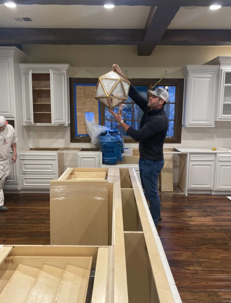
You didn’t think I was going to do this entire post without giving you a little behind the scenes do you? Here’s my main man, love of my life, business partner and best friend — the one, the only, Mike Miller — during the construction phase of this project. Sometimes I still can’t believe this whole journey y’all..from making our dream home happen 5 years ago to now making dream homes happen for other people, together, what a crazy but fun journey and I get to do all of it with my best friend.
To the Williams family, thank you for letting us be a part of this project and ANY projects with you guys. We love getting to work with y’all!
