Sharing is caring!
I’m so excited to finally share our new kitchen! It’s been awhile since I’ve blogged so first of all, let me remind you all that a year and a half ago, we made a huge, life-changing decision to sell our home and downsize into a smaller remodel that we had purchased. You can read more about our decision to move here (CC and Mike – We’re MOVING!)
Before I get into the nitty gritty of our kitchen design, I have to share some background on our new home which is completely different than our modern, white brick home with black windows that you saw in our previous home, which was the home that started my entire design journey. Our new home in South Tulsa is a charming French Country style exterior – covered in gray stone with a cute little courtyard in the front that welcomes our guests.
I am a firm believer that the architectural style of the inside of a home, should be cohesive with the architectural style of the outside of your home. In other words, it’s a bit of a design pet peeve of mine, when the outside and inside don’t compliment one another. So, I knew when I started designing this home that I wanted it to match the exterior – elegant, charming,
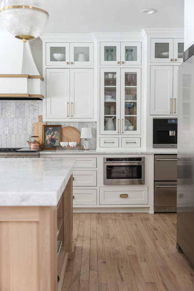
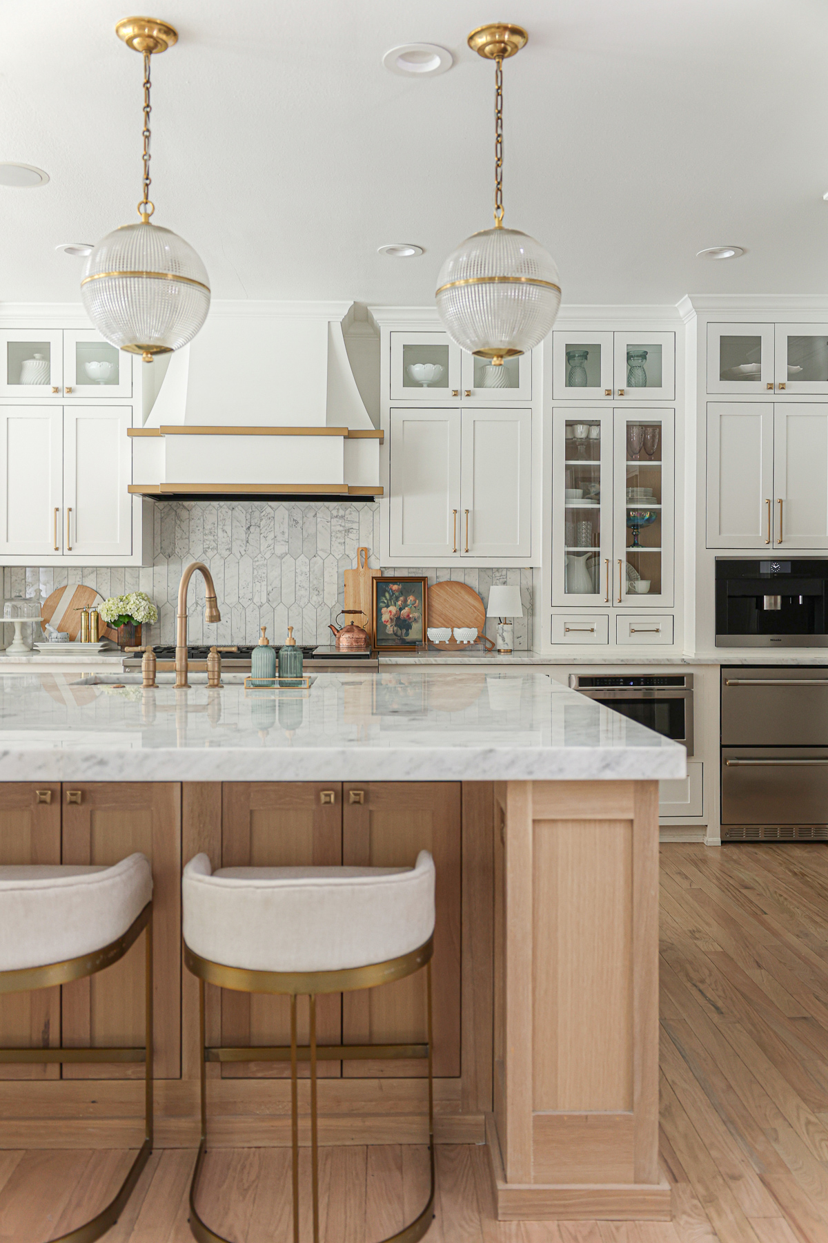
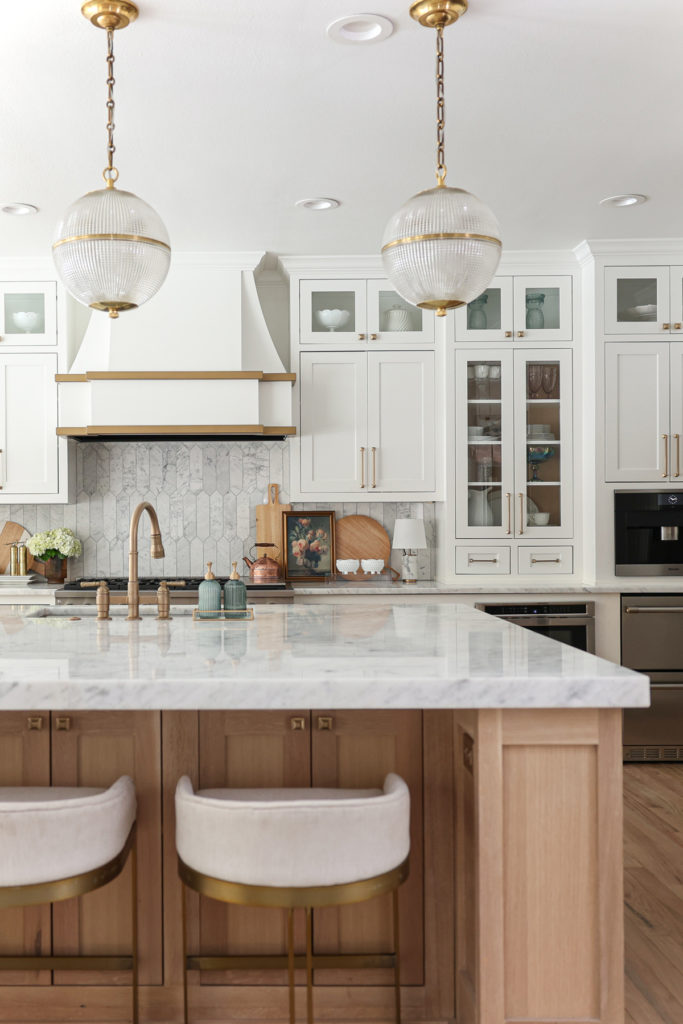
With that being said, the home we bought in South Tulsa is a charming French cottage exterior – covered in rock with a cute little courtyard that welcomes our guests . When I began designing the kitchen, I knew that I wanted it to be in line with the style of the outside of the home – charming, elegant – white and brass with wood tones mixed in and of course, all the marble!
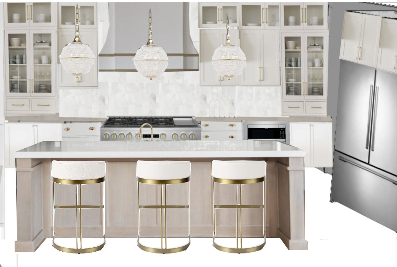
Here is a quick photo of the vision board I created for the kitchen before we started removing – Now remember! I did not know I was going to be moving into this house when I designed the kitchen. We were planning to flip this house and sell it. But of cour
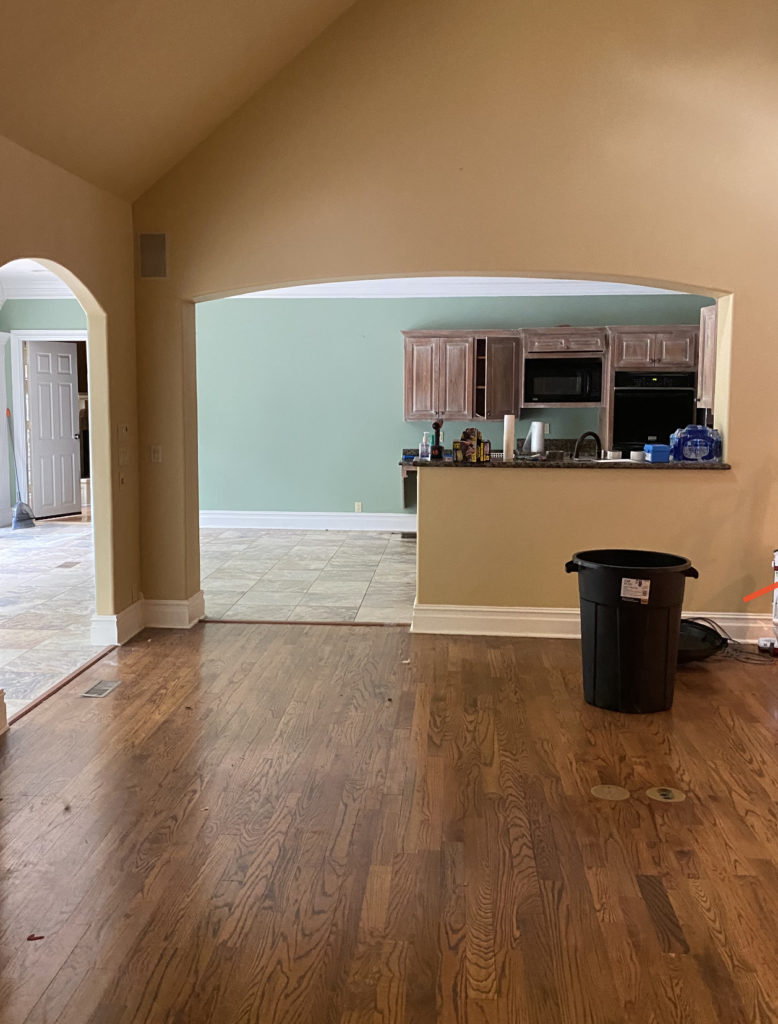
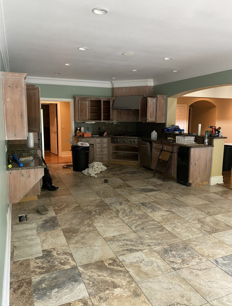
THE BEFORE PHOTO
Now that you’ve seen the Kitchen Design I created, let’s take a look at some before photos of what the kitchen looked like when we bought the Maplewood house. One of the main problems was that the kitchen had a half wall that blocked it off from the living room and my main goal was to completely open up the wall and make a focal wall on the back kitchen wall complete with a gorgeous vent hood. Then, of course, the previous kitchen was lacking a nice, large kitchen island which we had to fix as well! So here’s the BEFORE…
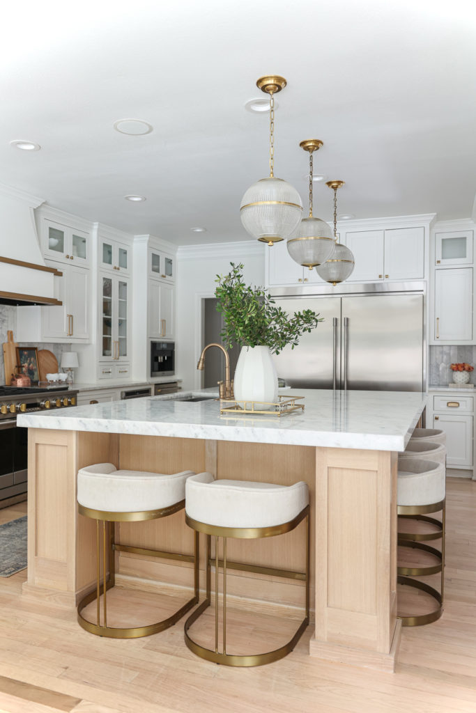
THE AFTER!!!
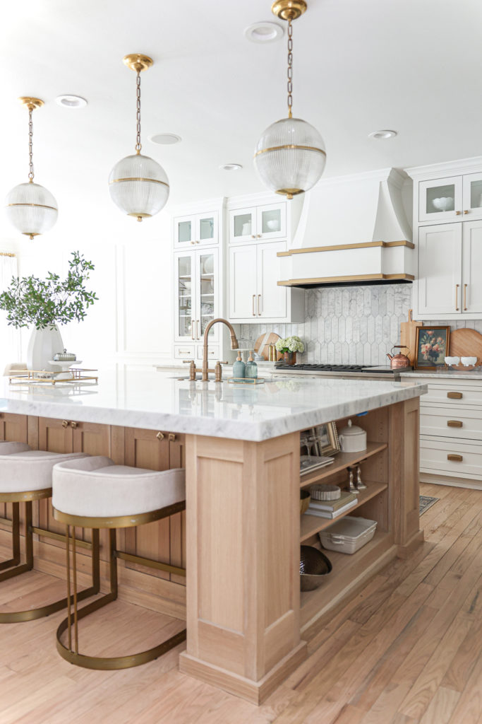
ANOTHER BEFORE and AFTER – from a different view!
THE FACTS
- PAINT – Benjamin Moore DECORATOR’S WHITE
- KITCHEN ISLAND – White Oak, Stain is Clear Coat with 5 percent white paint mixed in
- BACKSPLASH – Picket Marble Tile
- LIGHTING –
- APPLIANCES – MONOGRAM RANGE || REFRIGERATOR || DRINK FRIDGE || COFFEE MAKER || MICROWAVE || VENT HOOD | DISHWASHER
- FAUCET – Delta Broderick
- COUNTERTOPS – Shadow Storm Marble by Countertop Specialities in Tulsa, OK.
- CABINET PULLS – Arched Mission Cabinet Pull || Mission Pyramid Cabinet Knob
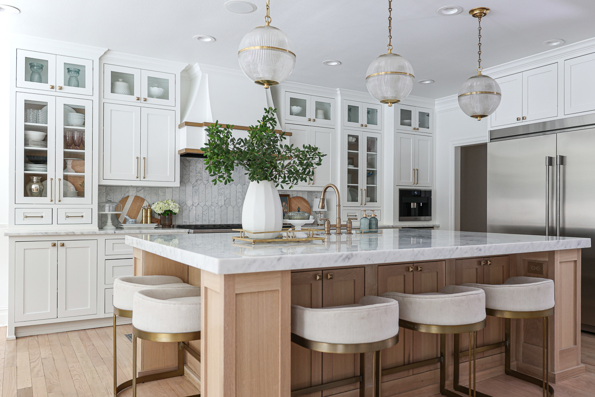
OUR BAR STOOLS
I absolutely love our bar stools – they are substantial in size and comfortable, plus I love the brass detailing.. They are available in CC and Mike THE SHOP and I will link them for you!

THE COUNTERTOPS
We worked with COUNTERTOP SPECIALTIES in Tulsa for our countertops throughout our house and had a wonderful experience. I knew that I wanted to do marble throughout our house and after visiting their store, I selected a gorgeous slab of marble called Shadow Storm. I couldn’t be happier with how it turned out. I also recommend doing a 6 cm finish on the edges which gives a more dramatic view of the marble.
OUR APPLIANCES
I’m going to be honest, Mike always picks out our appliances and does an amazing job. We love using Monogram Appliances and also highly recommend a drawer fridge and a built in coffee maker which we use in all our homes. You can shop our appliances below by clicking on the photo !

