Sharing is caring!
We’re back with yet another reveal from our 2020 projects — THE GUTHRIE PROJECT
So I have to tell you guys the back story on this house…we got a call from a friend and client in March of 2020 right when COVID happened. Mike and I were staying at home like the rest of America and working from our kitchen countertop. When we got the call asking us to furnish this entire house in a week, we looked at each other with wide eyes and said WELL, WHY NOT?!? So, I did the furnishing designs for the entire house in two days while Mike did what he does best (the details and all of the ordering/logistics) and a few weeks later, two trucks arrived with a house full of furniture. Much like our Sports Armory Project this project was fast-paced and intense but I always say that Mike and I work best under pressure. We loved furnishing this home for our client and friend and are excited to show you inside!
If you are moving and need your house furnished, we would love to take care of that for you and you can always fill out our contact form here and tell us about your project! Also, YOU CAN SHOP ALL THE PRODUCTS WE USED TO FURNISH THE GUTHRIE PROJECT HERE
The Entryway
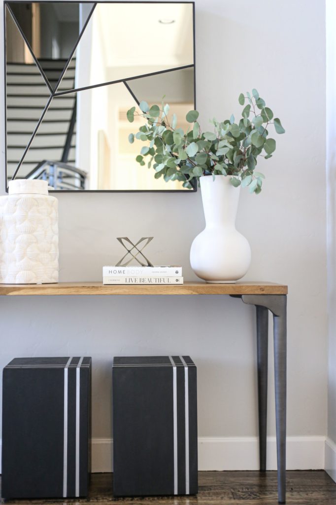
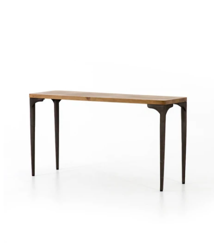
The entryway sets the tone for the house, and our friends wanted the Guthrie Home to have a very clean, modern feel that was still inviting. The metal legged table and black and white accents have so much personality! I chose it to help draw people into the home. Love!
The Study
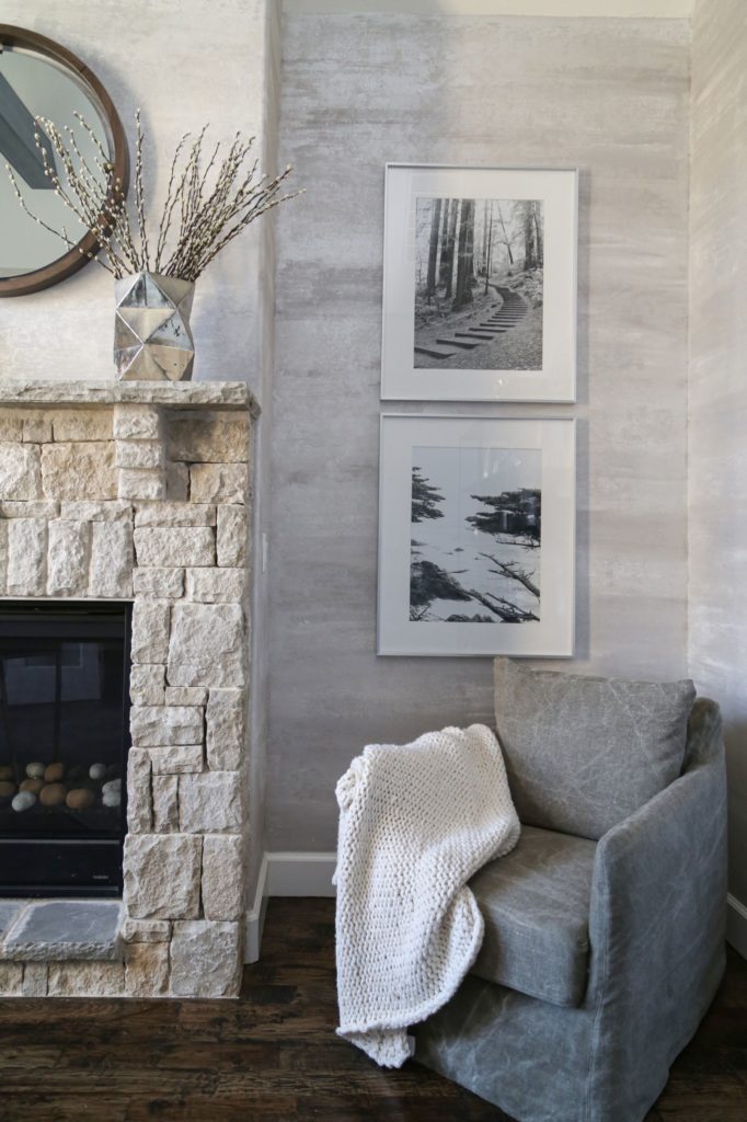
The study is a bonus room in this home that was full of potential! The stone fireplaces in this home were so inspiring. I just knew I had to play off of the greys and creams in the stone. I chose some amazing grey and cream chairs to complement the theme. So beautiful and cozy!
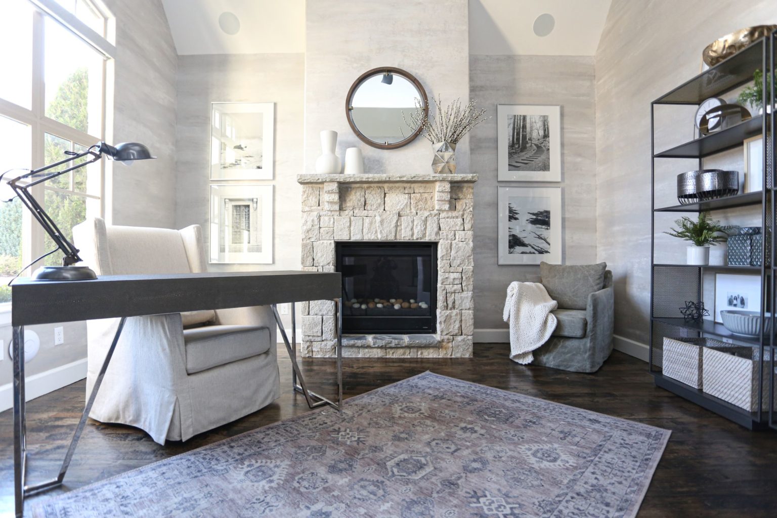
Another accent I loved was the artwork in the room. The client wanted black and white prints, and I had some beautiful prints in CC+Mike: the Shop. We went with the Journey and Cypress prints for a clean, put-together look. Finally, we stacked the shelves with home decor accents from CC+ Mike: the Shop.
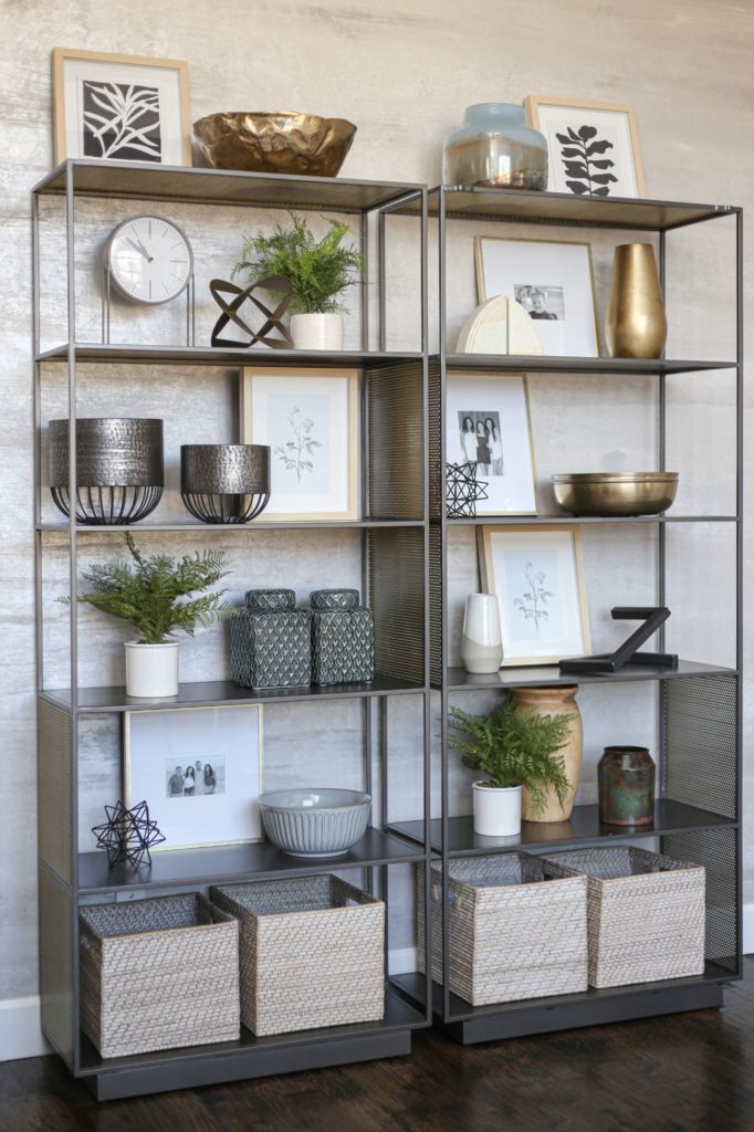
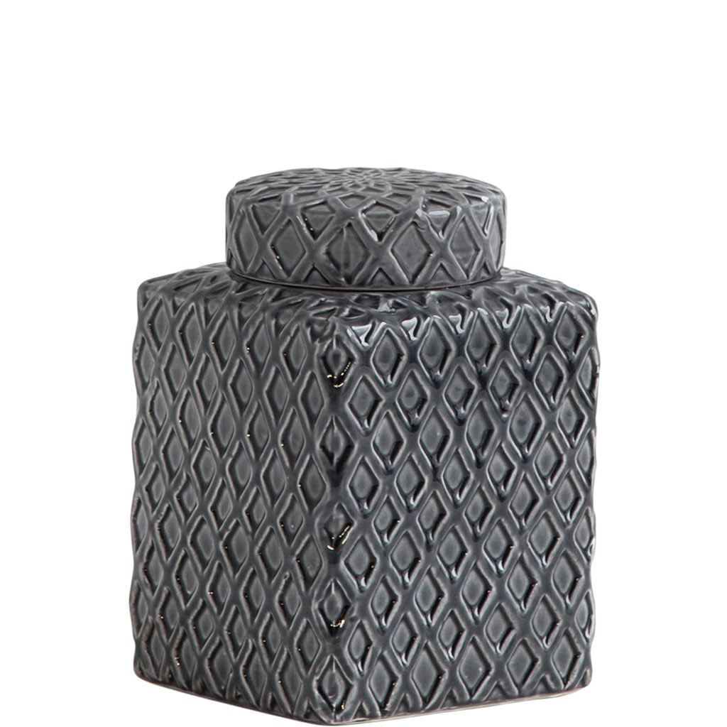
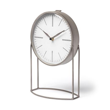
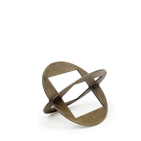
If you’ve been following CC+Mike for a while, you will know that my most recent design obsession has been shelving. It is a gorgeous storage solution, providing the perfect opportunity to stage family keepsakes or fun decorations. Of course, I turned to CC+Mike: the Shop for these details! All of the home decor accents in this design are found in the CC+ Mike Shop. I played with mixing metals, combining the Aurus table clock and the funky Cusco decor. I also fell in love with these Coventry vases. They are absolutely stunning! The perfect accent for any bookshelf.
Living Room
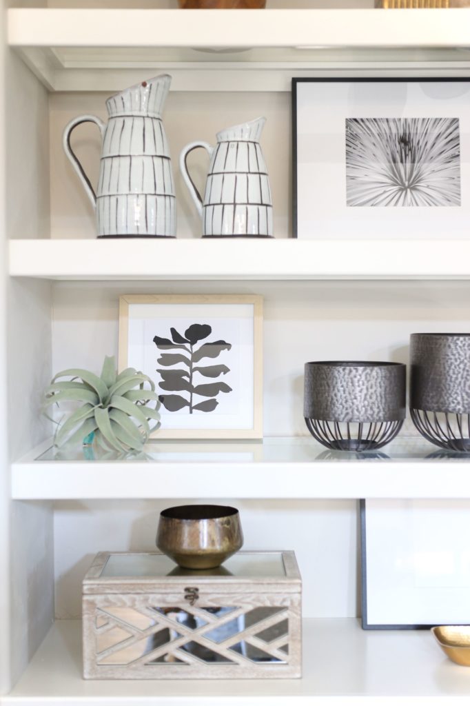
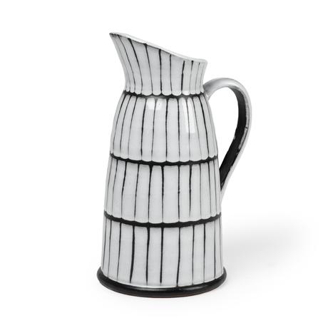
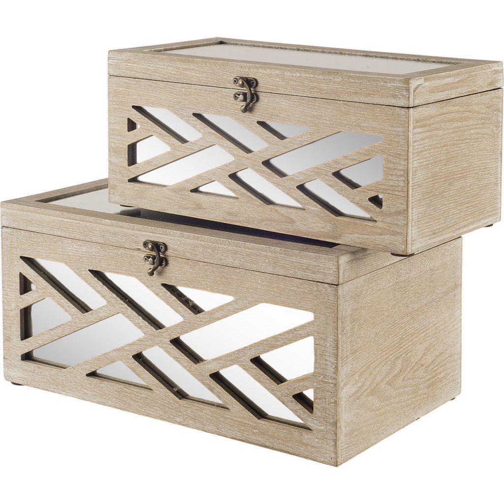
In the living room, I focused on bringing more natural touches on the shelving. This tiffany box set was a perfect choice! The geometric mirror pattern brought a lot of visual interest to the shelf. I also added the Lome pitcher. I love the lines of this piece and the personality it brings anywhere I place it. Also, if you’re looking for the perfect leather chairs I love these cognac beauties that we used in the Guthrie living room!
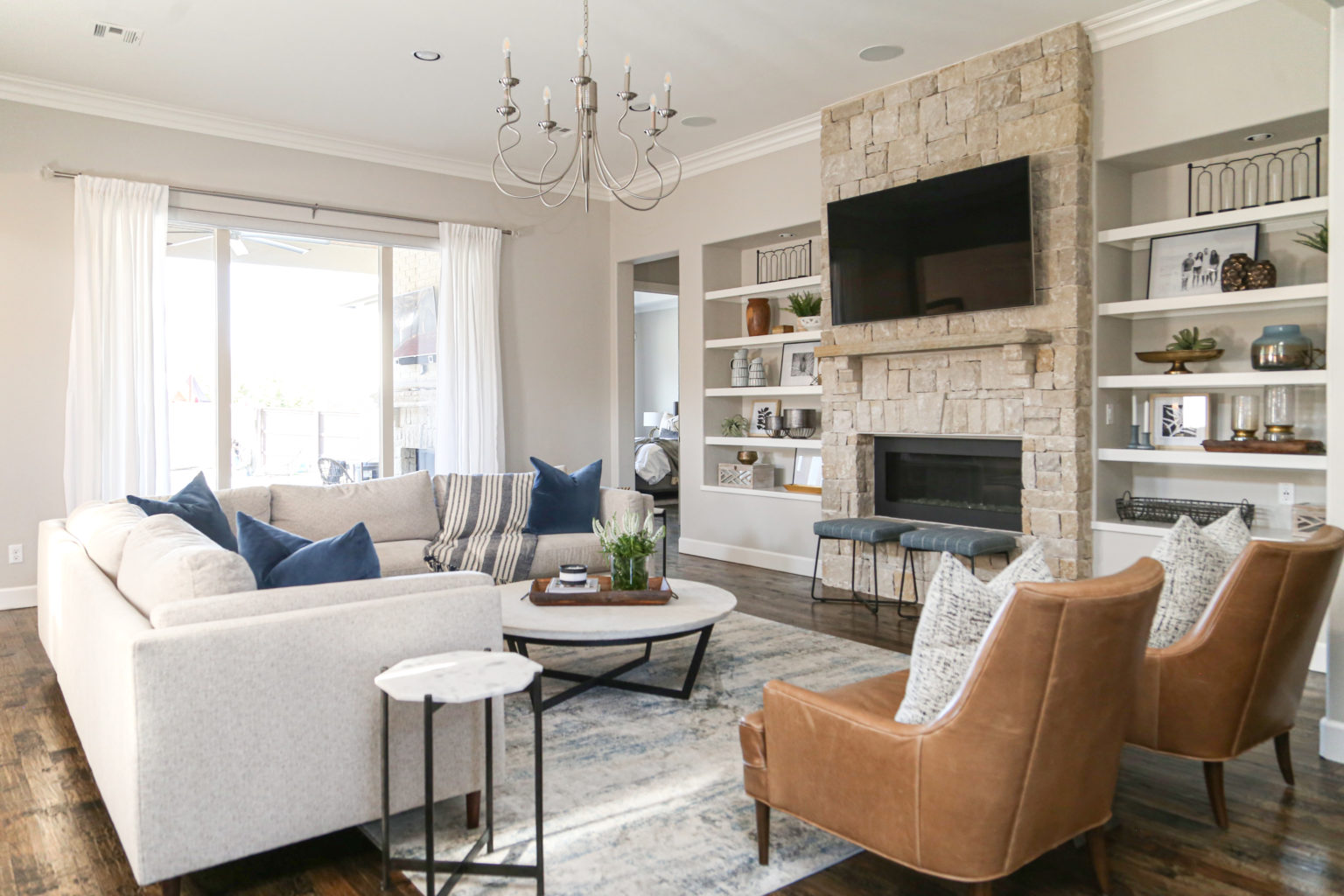
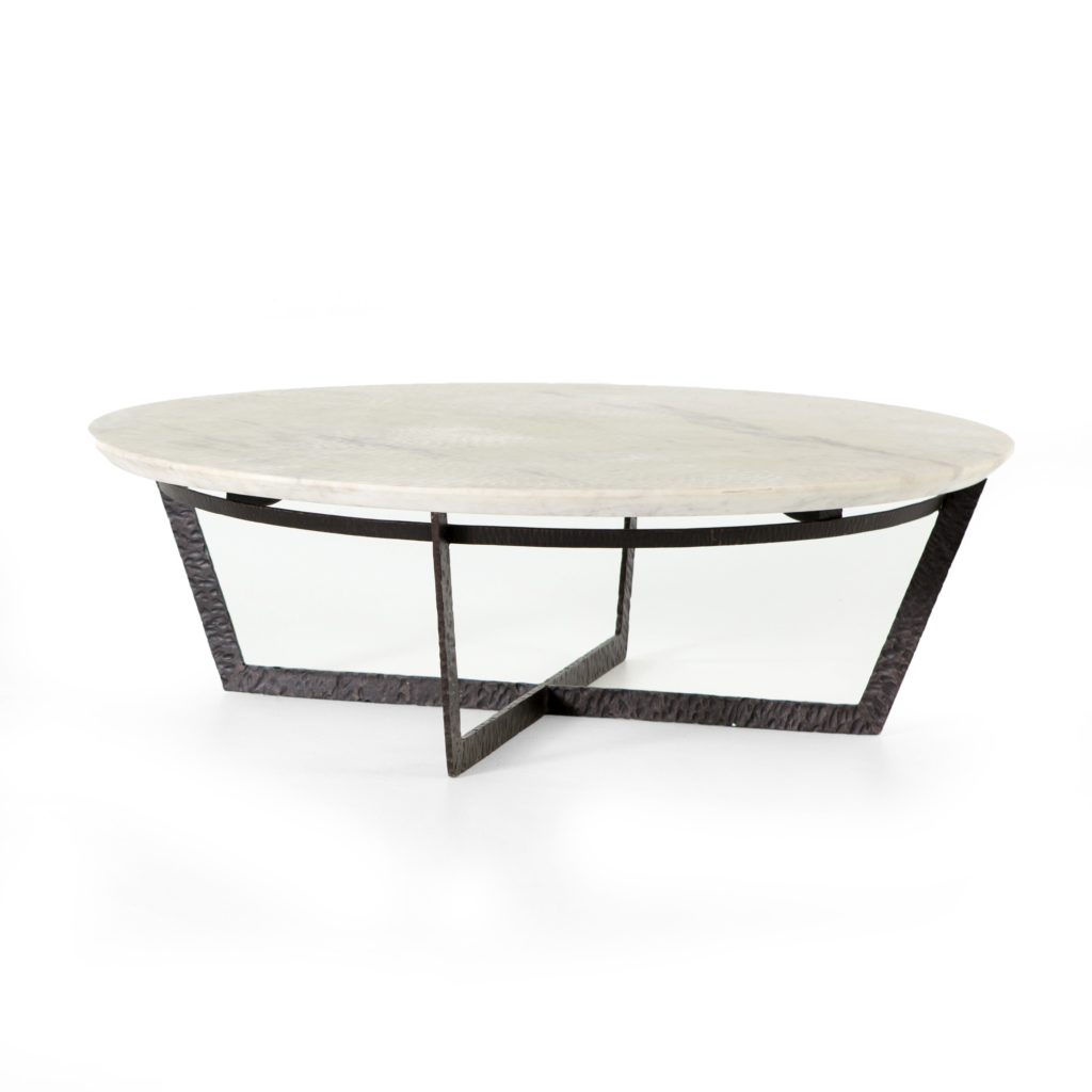
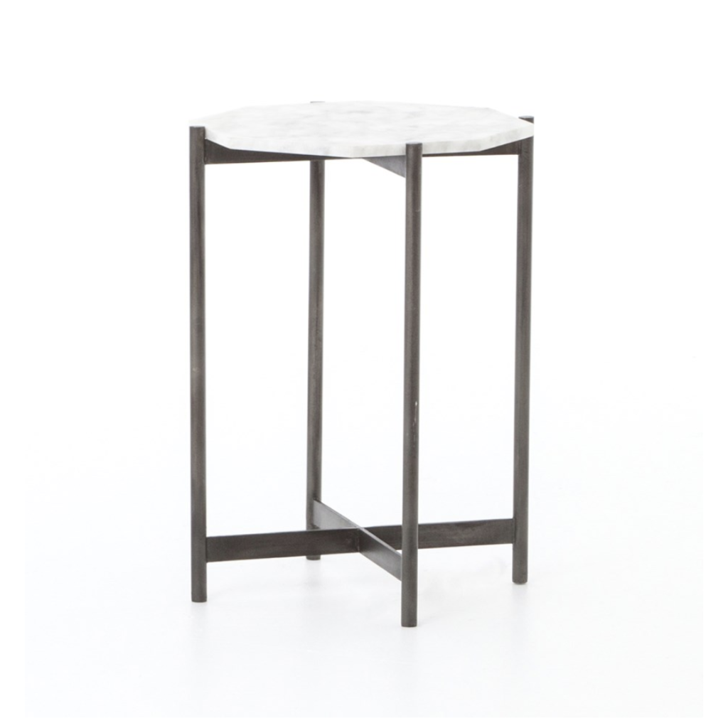
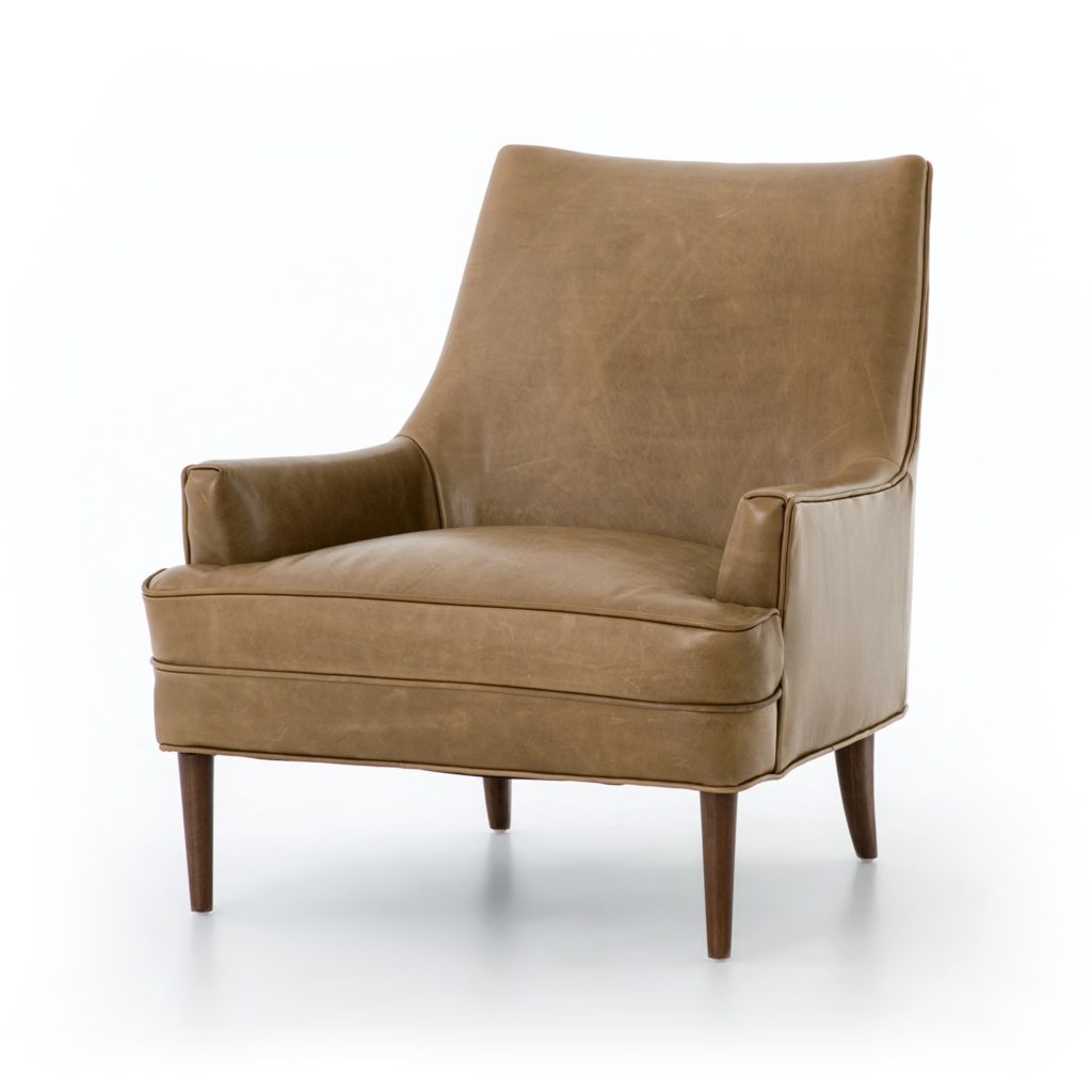
The living room is the heart of the home, and the Guthrie Home was no different. I wanted to make this room not only beautiful to look at but comfortable to live in. I started with the warm and inviting Danya chairs. Their buttery cognac leather is absolute perfection and I love the wooden legs as well! They bring a much-needed change of pace from all of the cooler accents. I also adore the combination of the Felix coffee table and the Adair side table. They pair so well and indulged my love for dark metal.
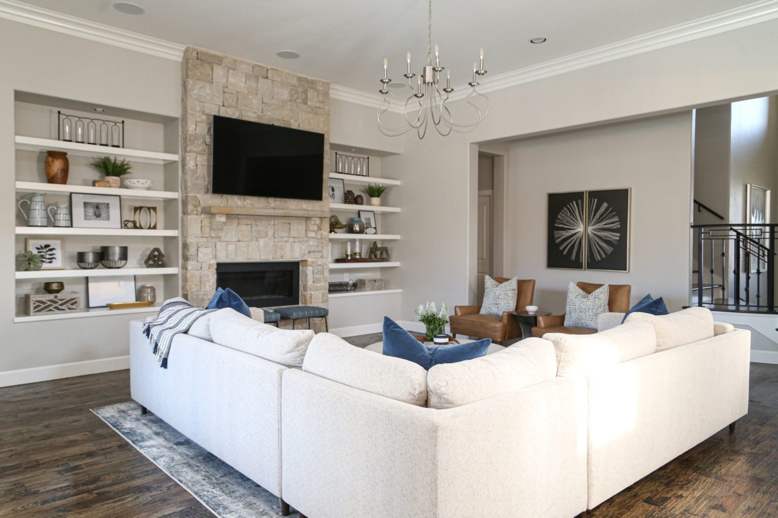
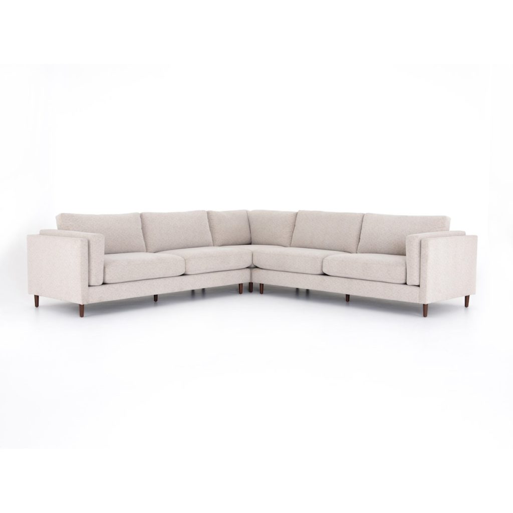
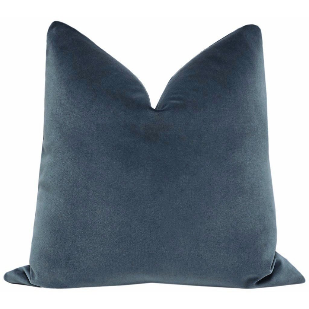
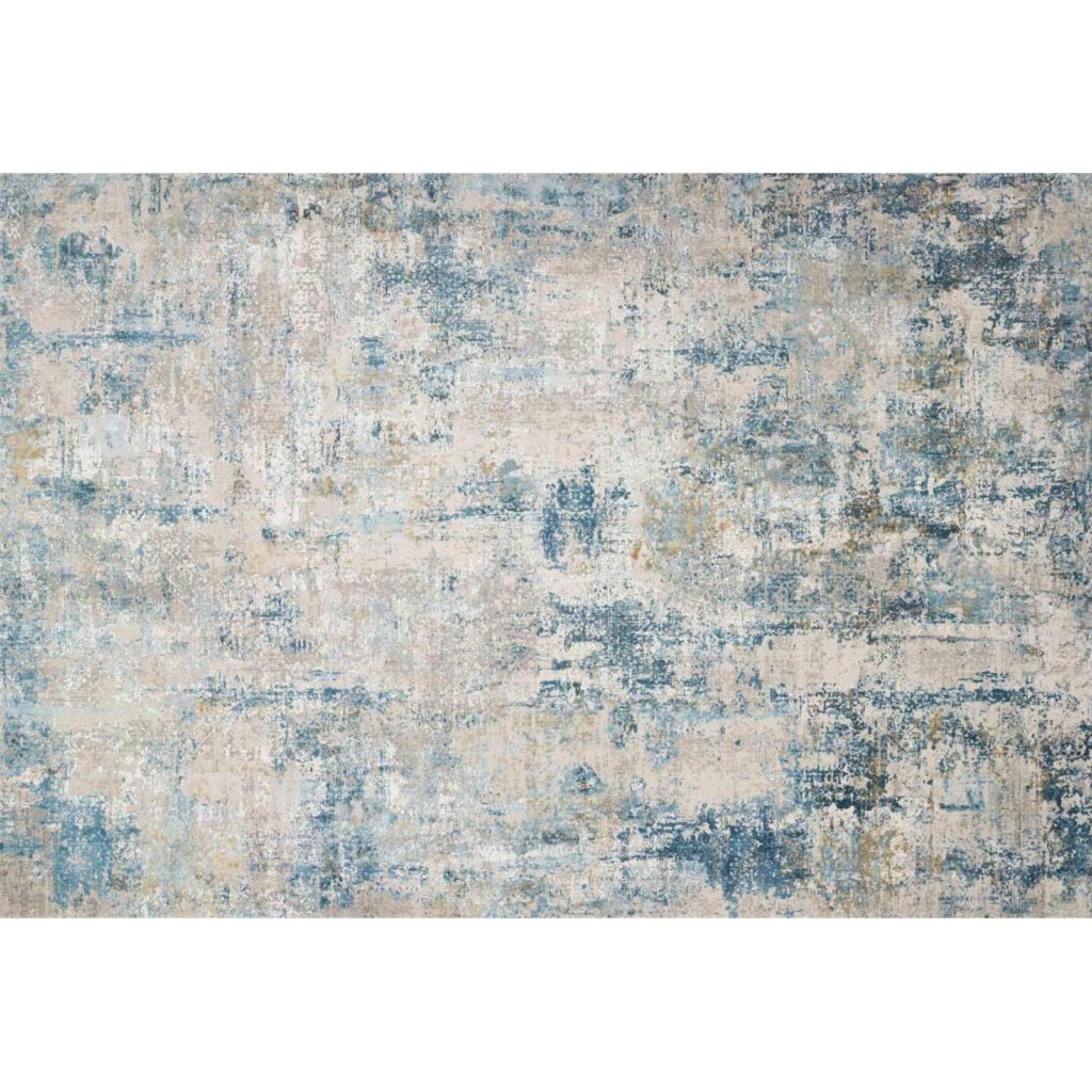
I was also able to use one of my all-time favorite sectionals in this room. The Elijah 3-piece sectional has clean lines without sacrificing comfort. I feel like it can make any room feel like home, all it needs is some throw pillows. I used our signature Prussian velvet pillows to set the room off. The final touch was the Sienne rug from our shop and the room was complete!
Game Room
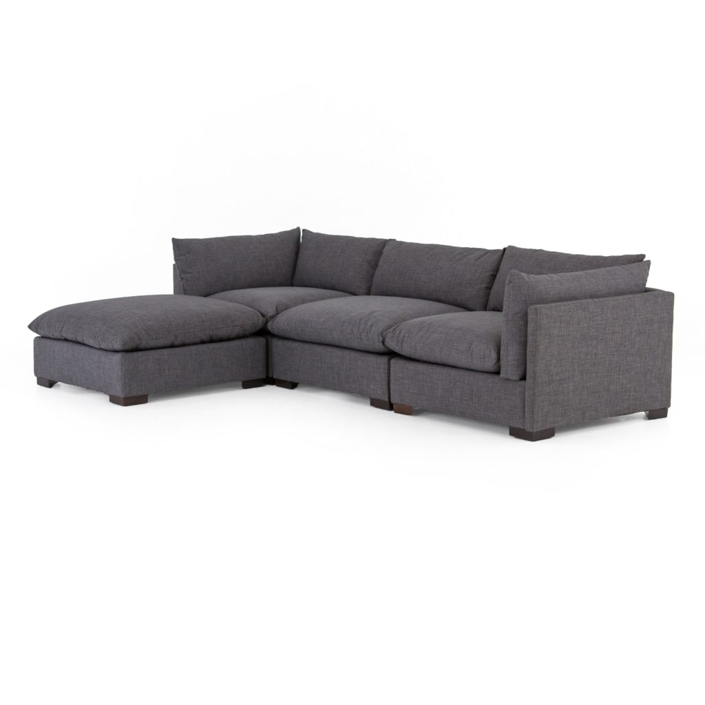
The game room was yet another bonus room in the Guthrie Home that I had an absolute blast designing! I got to use another one of my favorite sectionals in this room. People always ask me, “CC, what do you recommend for seating in a game room?” It’s the Westwood sectional! The dark color fabric is perfect for heavy use. It doesn’t show stains, and it is so cozy and comfy. I also love that it doubles as a sleeping couch if your kids have friends over and need an extra bed for someone to crash on.
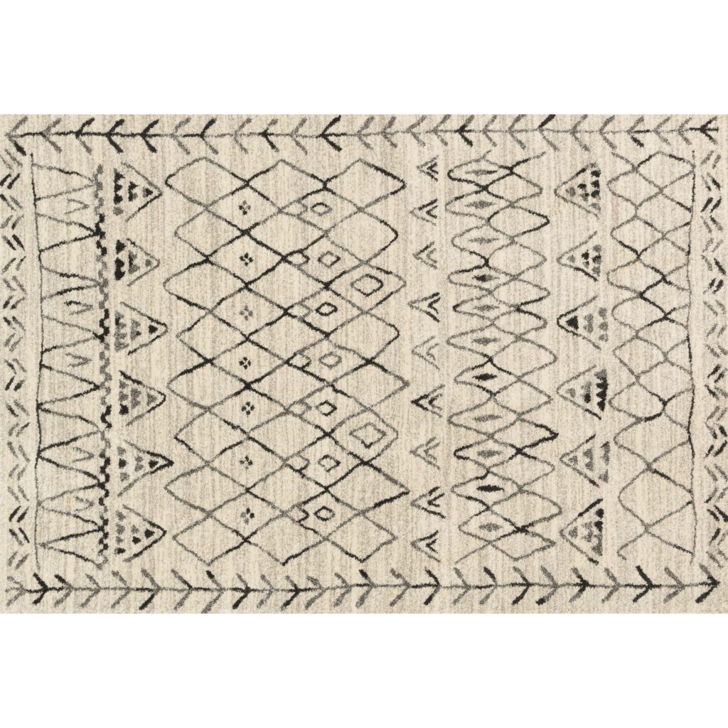
The Westwood is the perfect alternative if you have a smaller space, and it goes so well with the Emory rug! The geometric pattern is so cool. We also featured some black and white prints of their family photos. It’s such a beautiful personal touch!
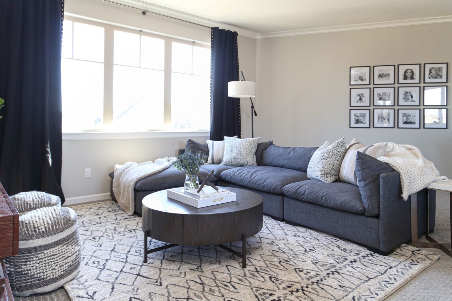
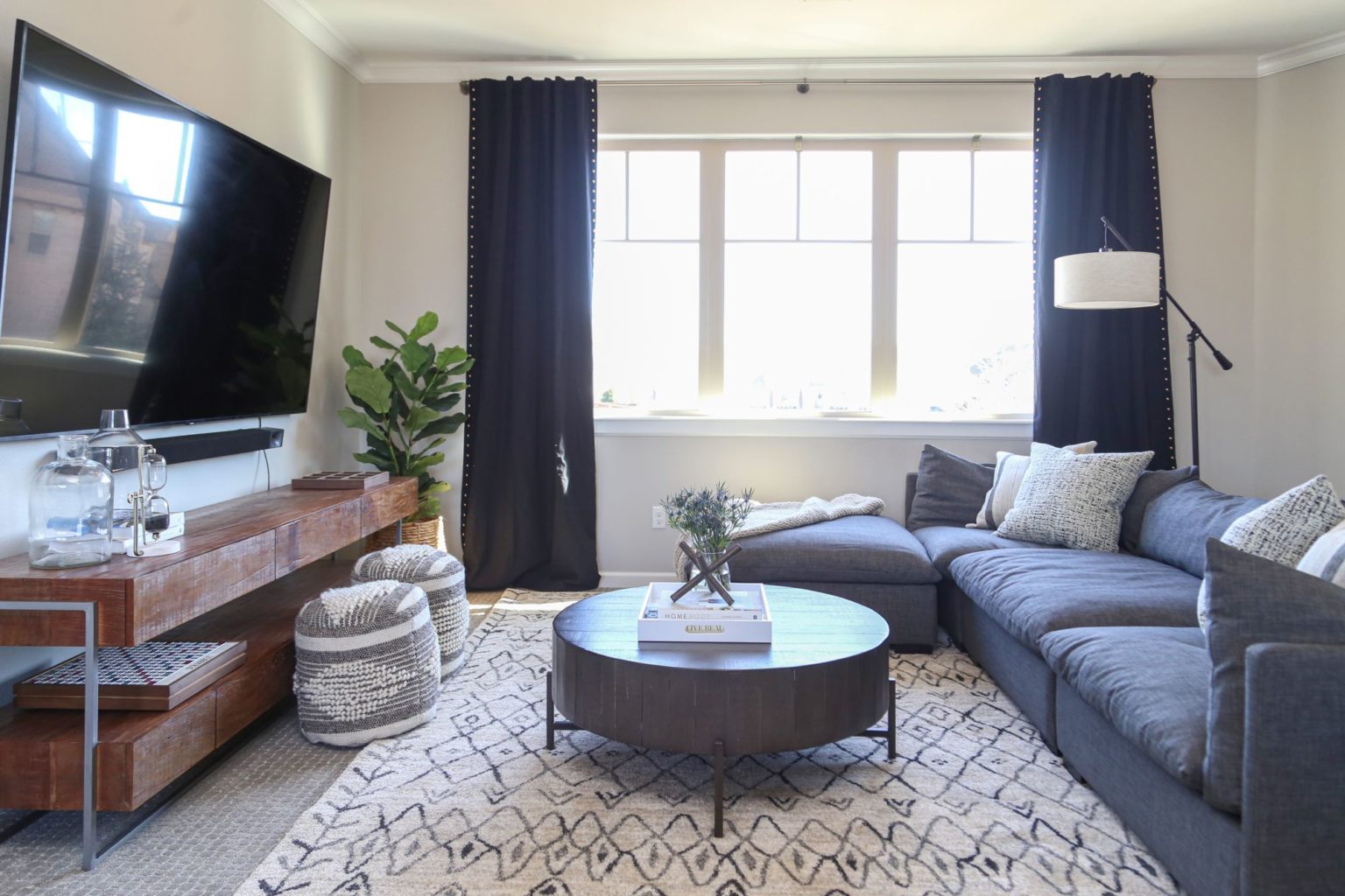
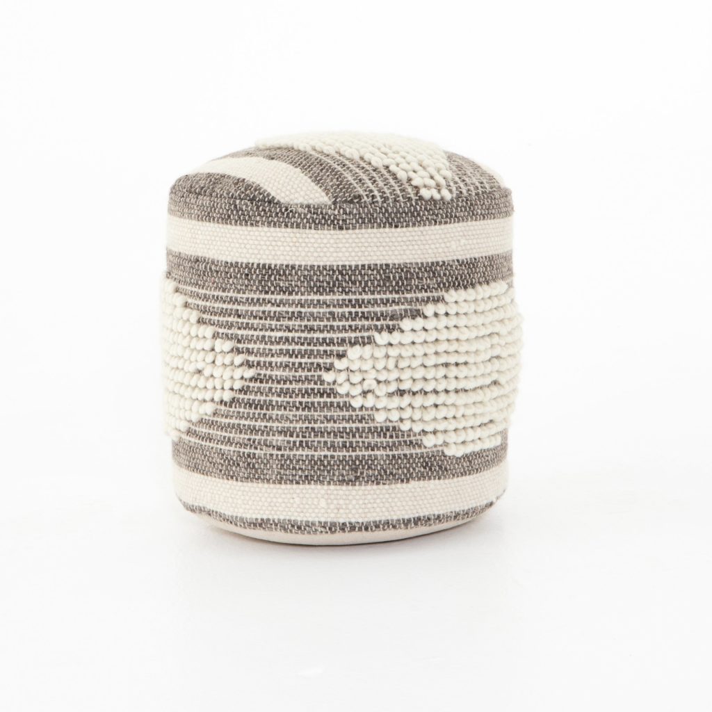
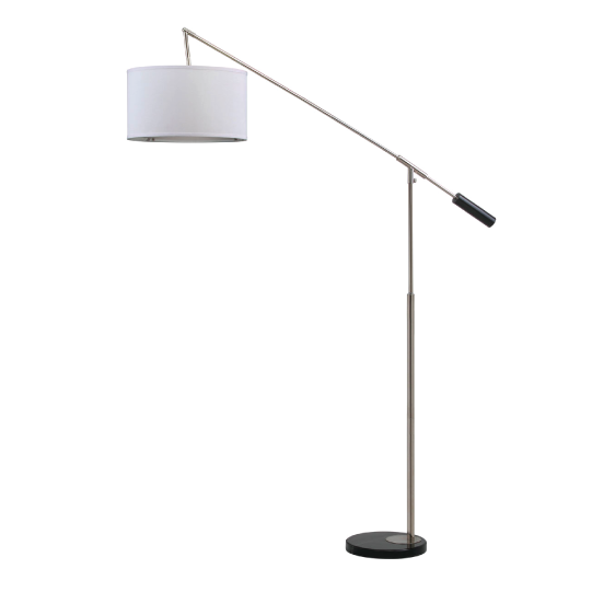
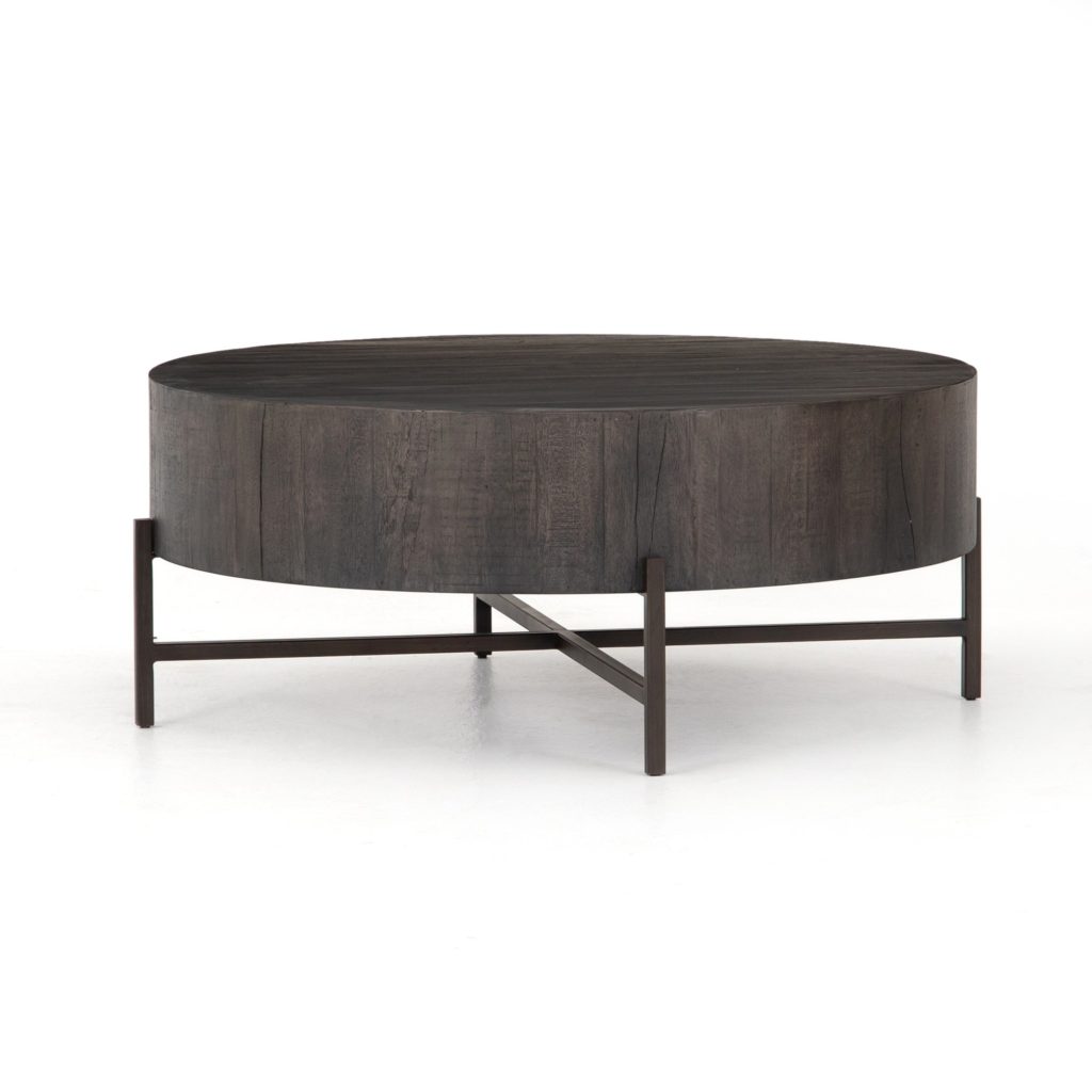
To continue playing with the juxtaposition of geometric patterns and round shapes, I added some unique CC+Mike pieces to the mix! The curves of the Carina lamp (and Tinsley coffee table add some variety and edge to the space. I also brought in the Jacinta poufs for extra seating. So cute!
Guest Room
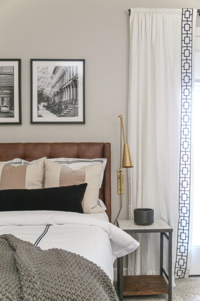
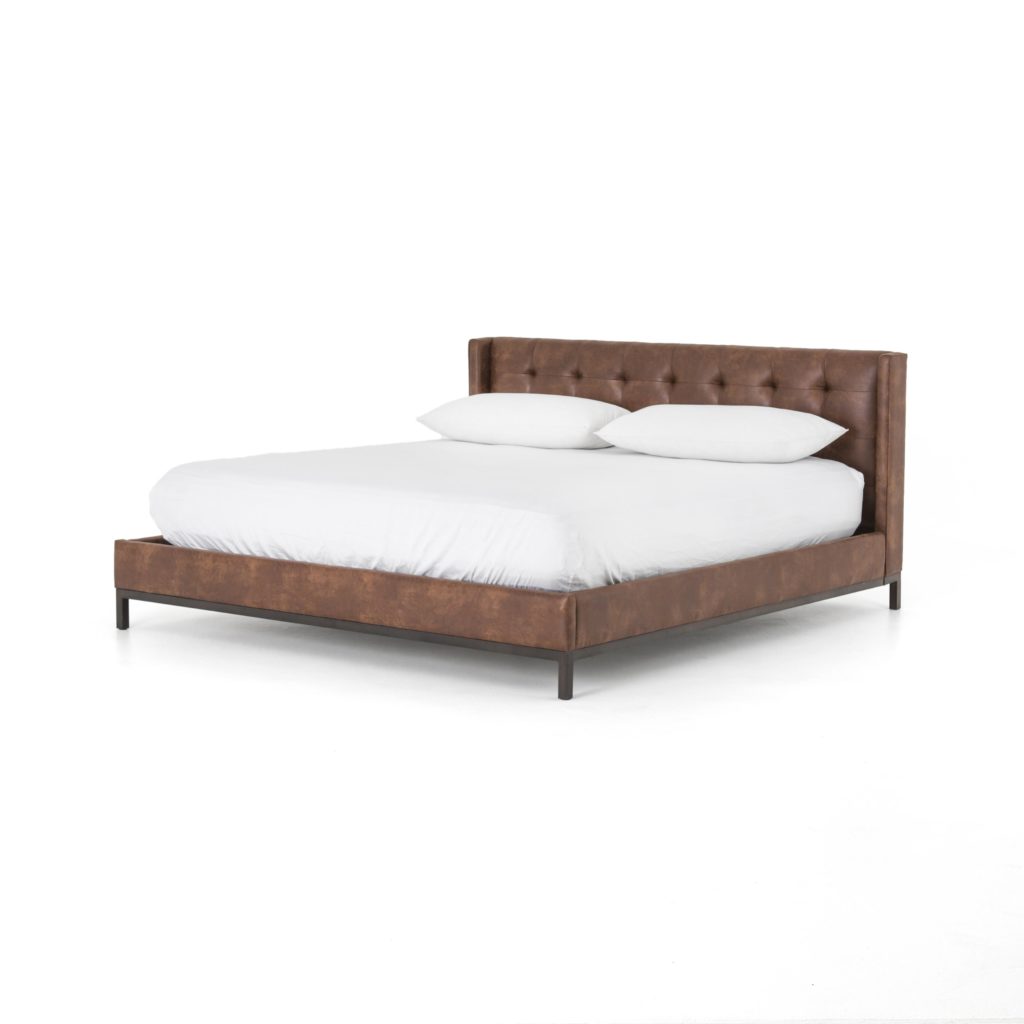
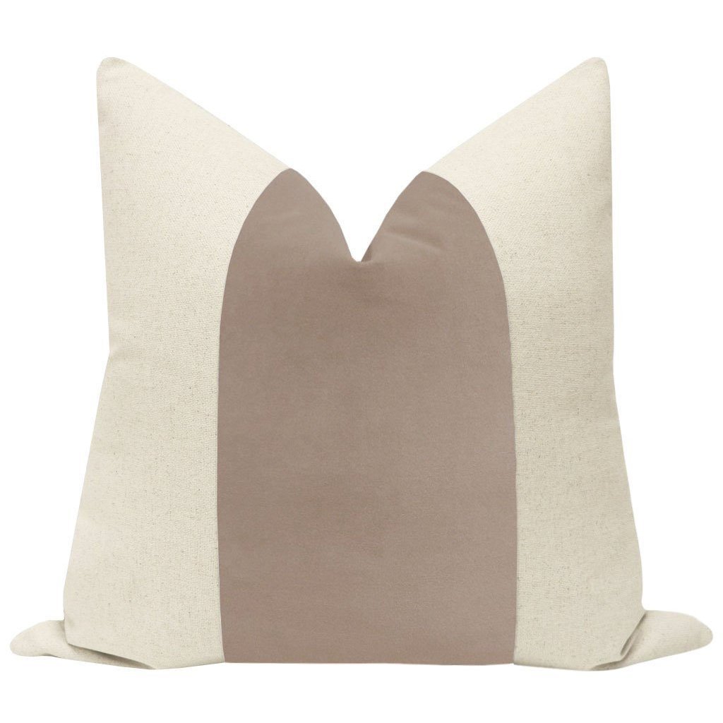
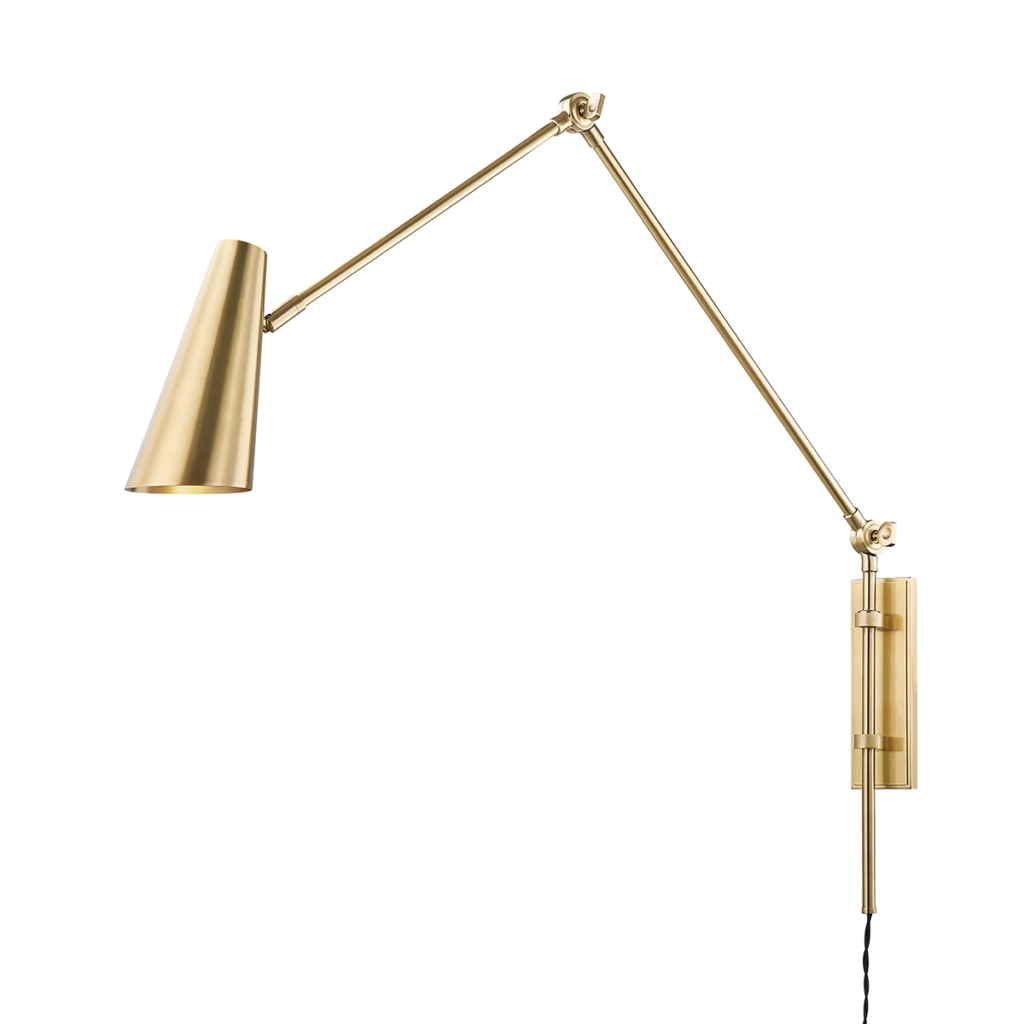
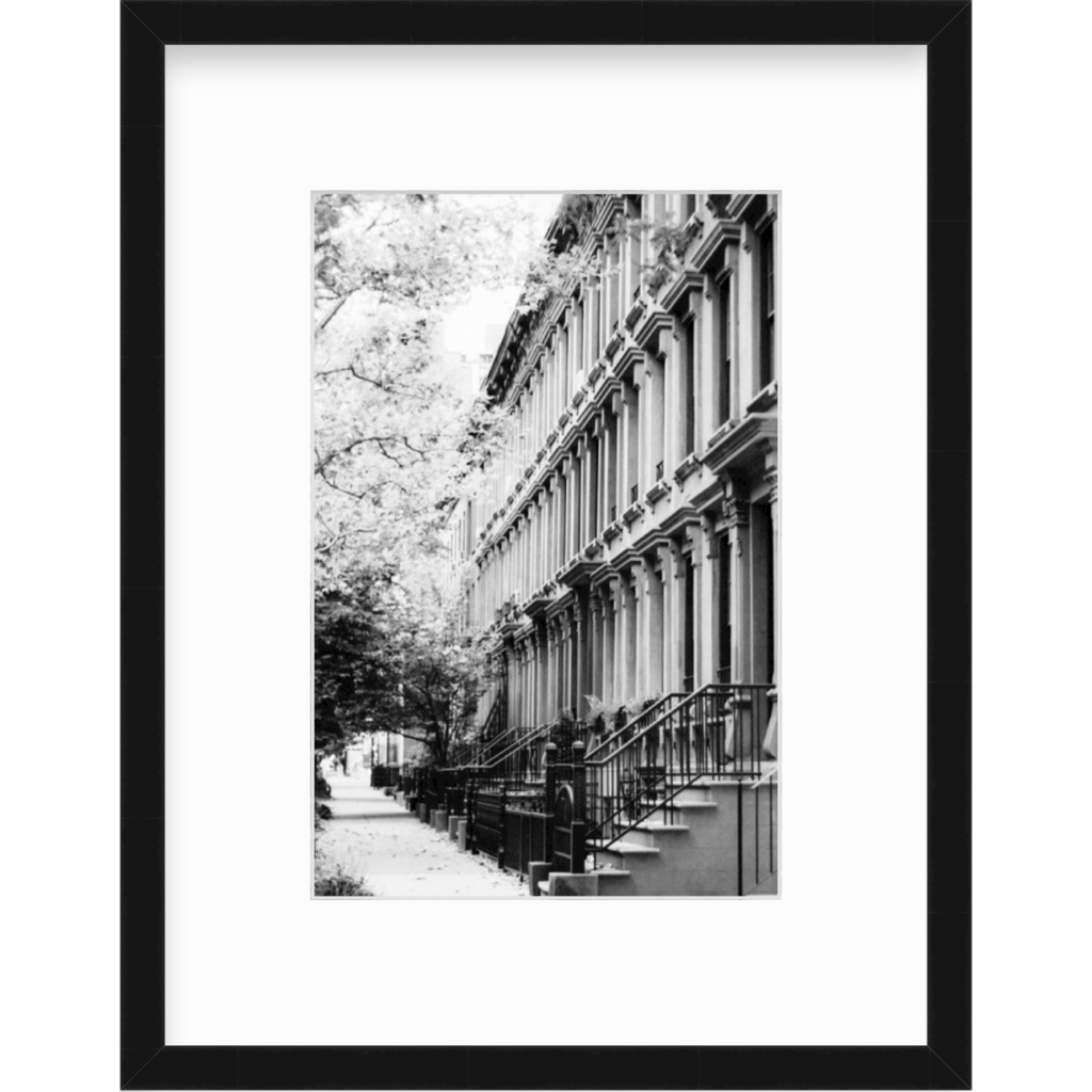
The guest room was a simple redesign. The space was ready for a refresh, we just swapped out the bed for the gorgeous Newhall tufted leather frame. We paired that with new bedding and a few of our signature throw pillows. The Lorne wall sconces offer a versatile lighting solution for when guests visit. I also love how the black and white prints make the room cohesive with the rest of the house!
Girls’ Rooms
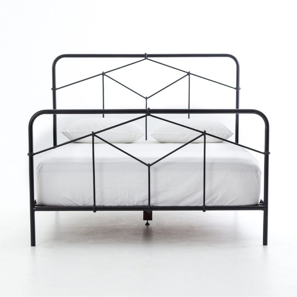
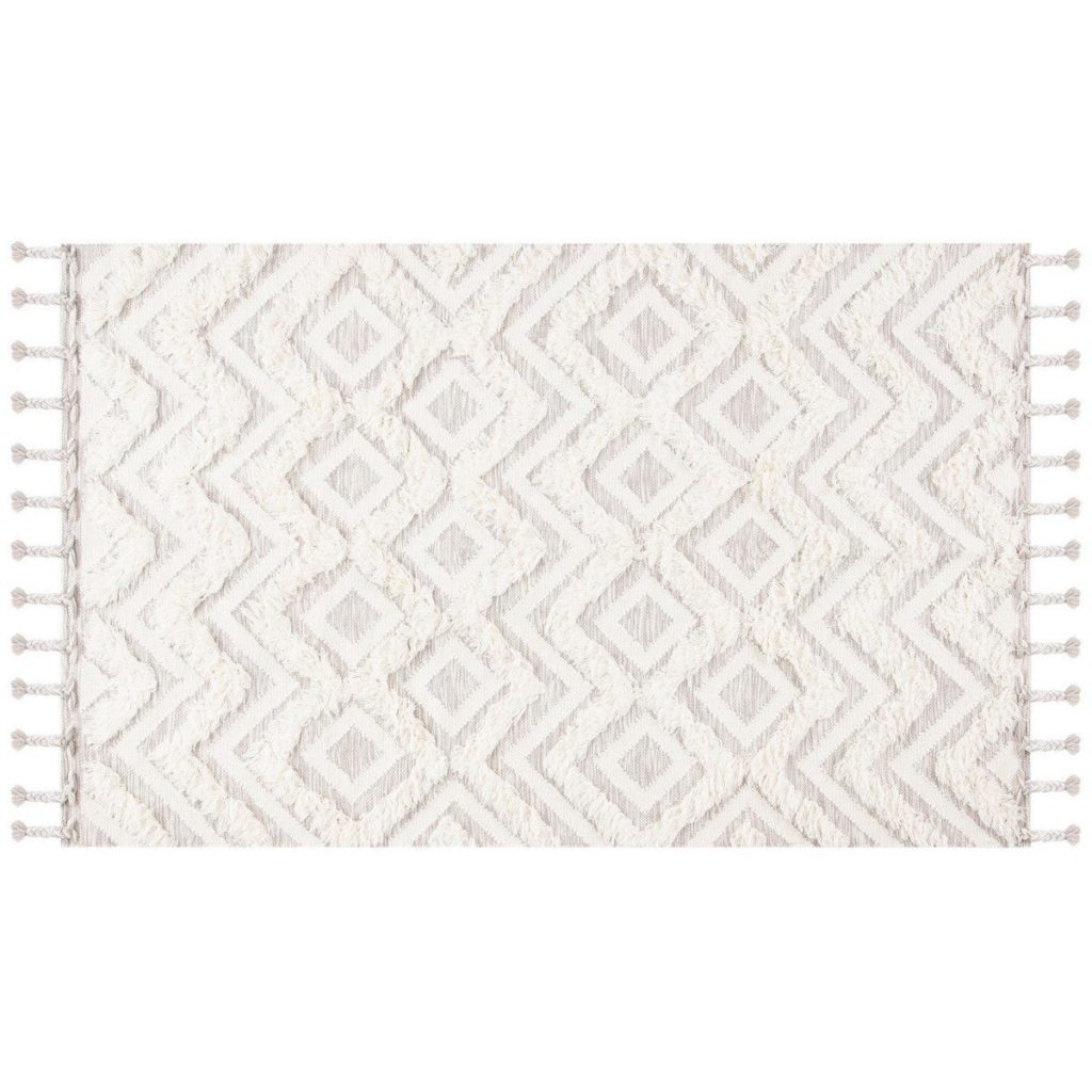
We had two girls’ rooms to design in the Guthrie Home and I couldn’t wait to get started. With the help of our clients, we chose new bed frames to complement each room. In the first girl’s room, we used the black Casey metal bed frame. It adds so much depth to the lightroom. The ivory Easton rug is the perfect plush companion to this hard bed frame.
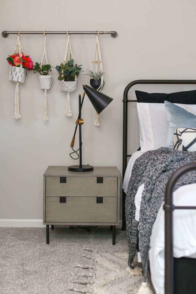
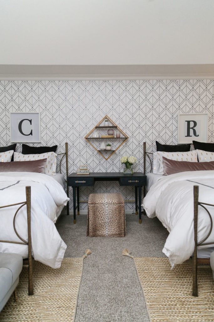
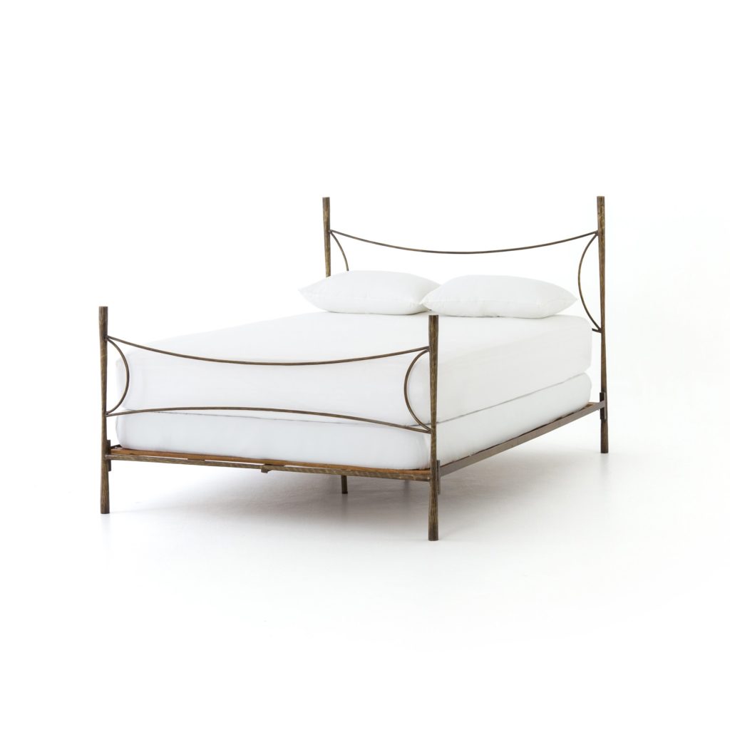
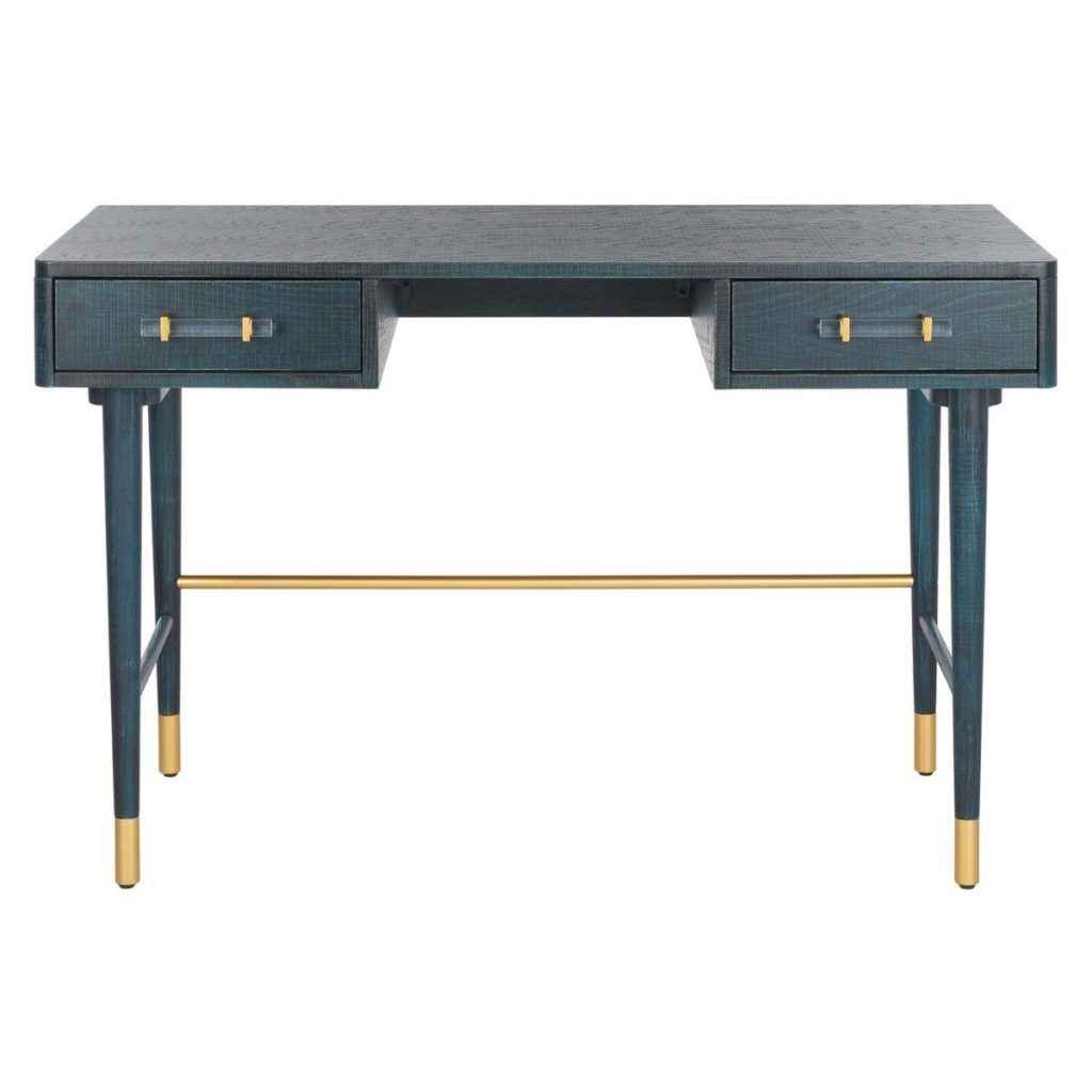
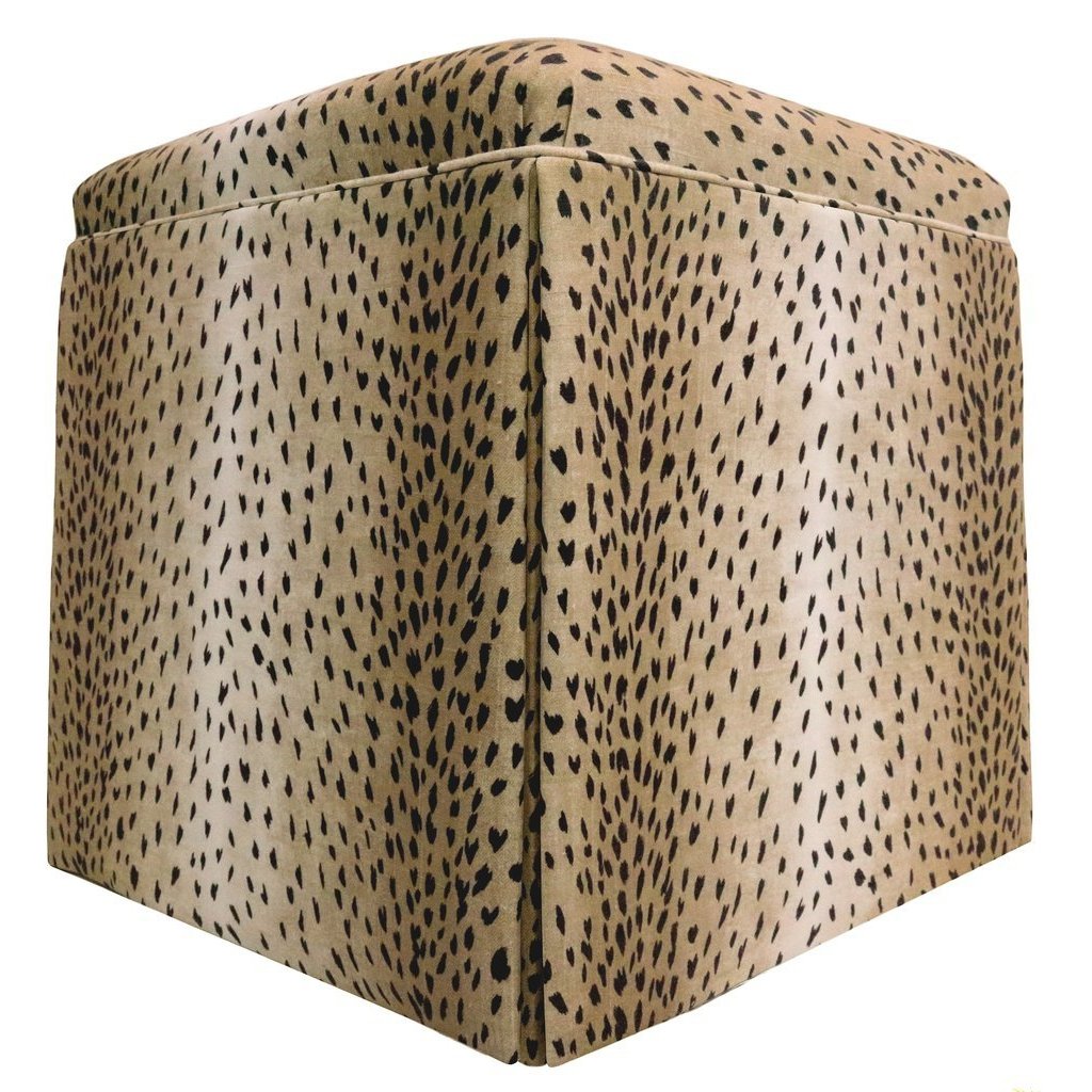
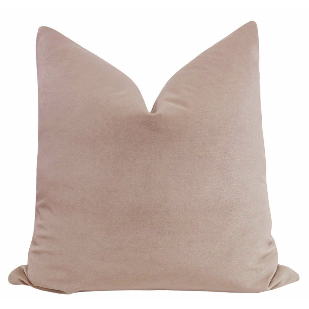
In the other girl’s bedroom, we opted for a pair of Westwood brass bed frames. I love how they look next to this amazing mid-century desk. Our signature pillows in mauve were the perfect match for the feel of the room. And if you know me, you’ll know that I love animal print. This room was not complete without a beautiful antelope print ottoman!
Master Bedroom
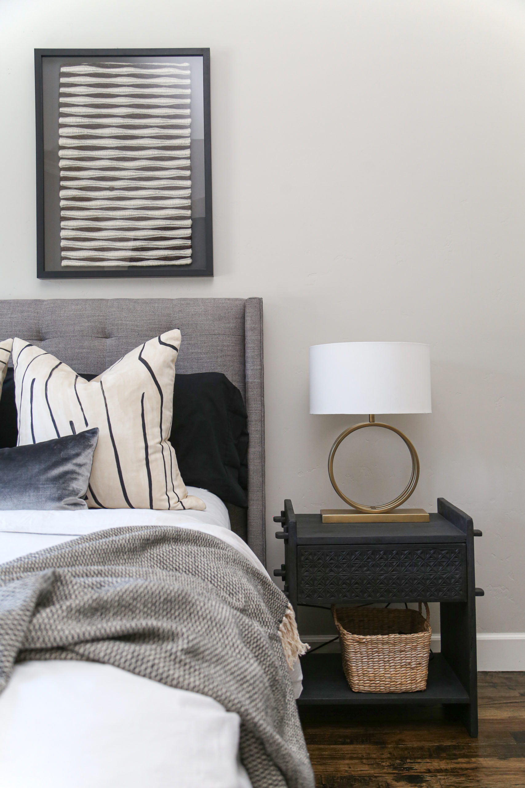
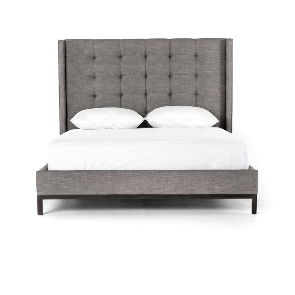
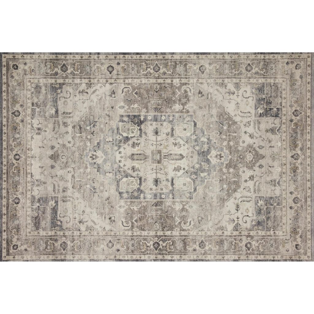
The master bedroom was by far my favorite room in the Guthrie Home to design. There are so many details that I was excited to include! Just like the girl’s rooms, I started by swapping out the bed frame. Out with the old and in with a brand new grey Newhall frame. When paired with the Hathaway rug it makes the whole room more sophisticated.
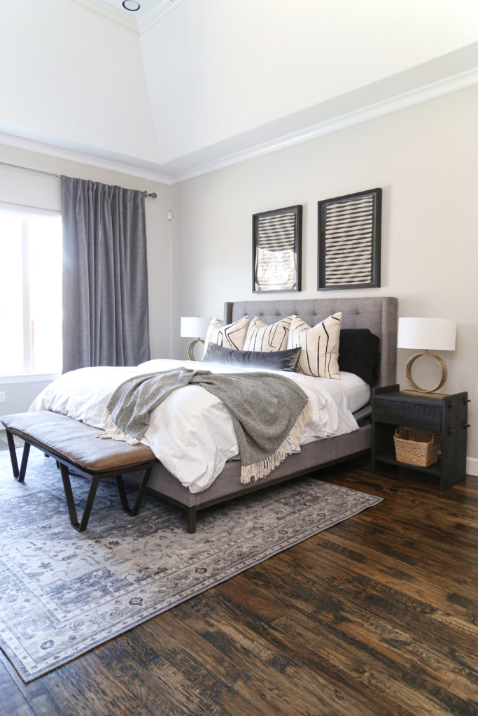
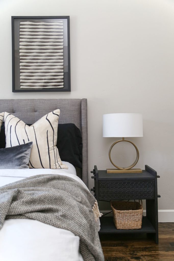
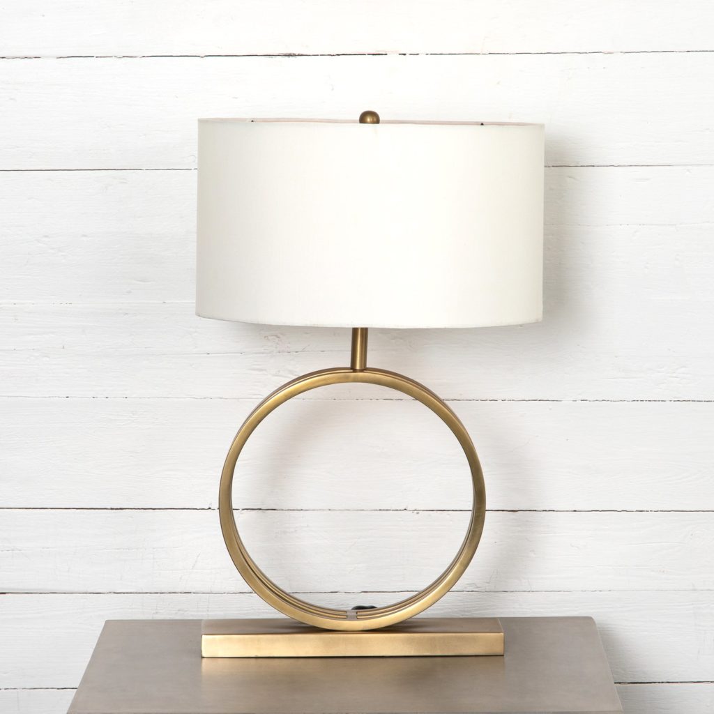
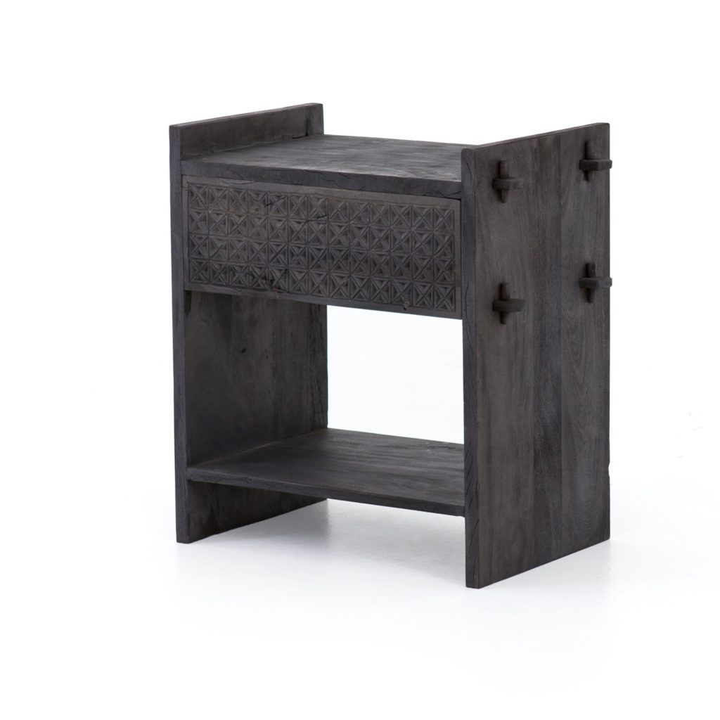
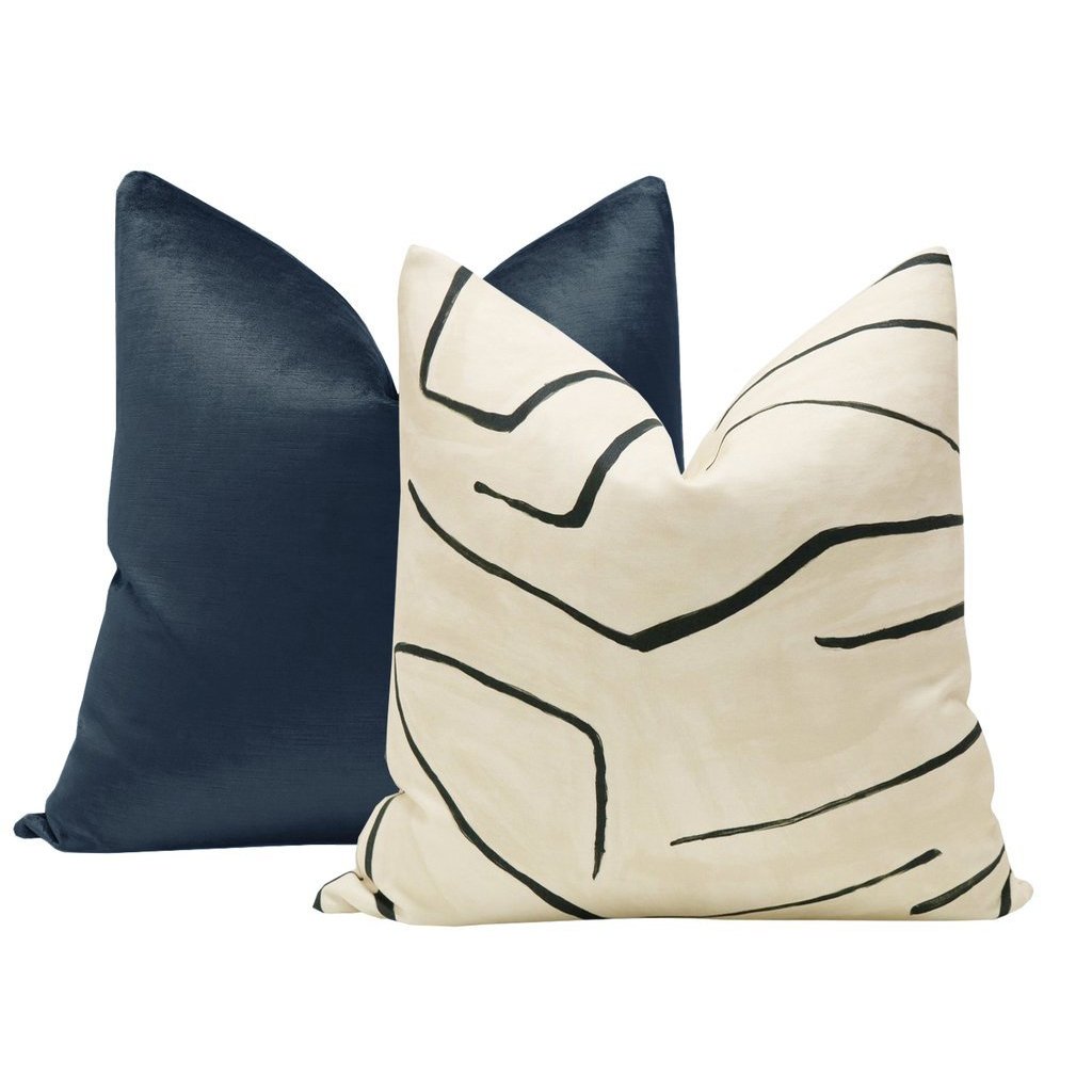
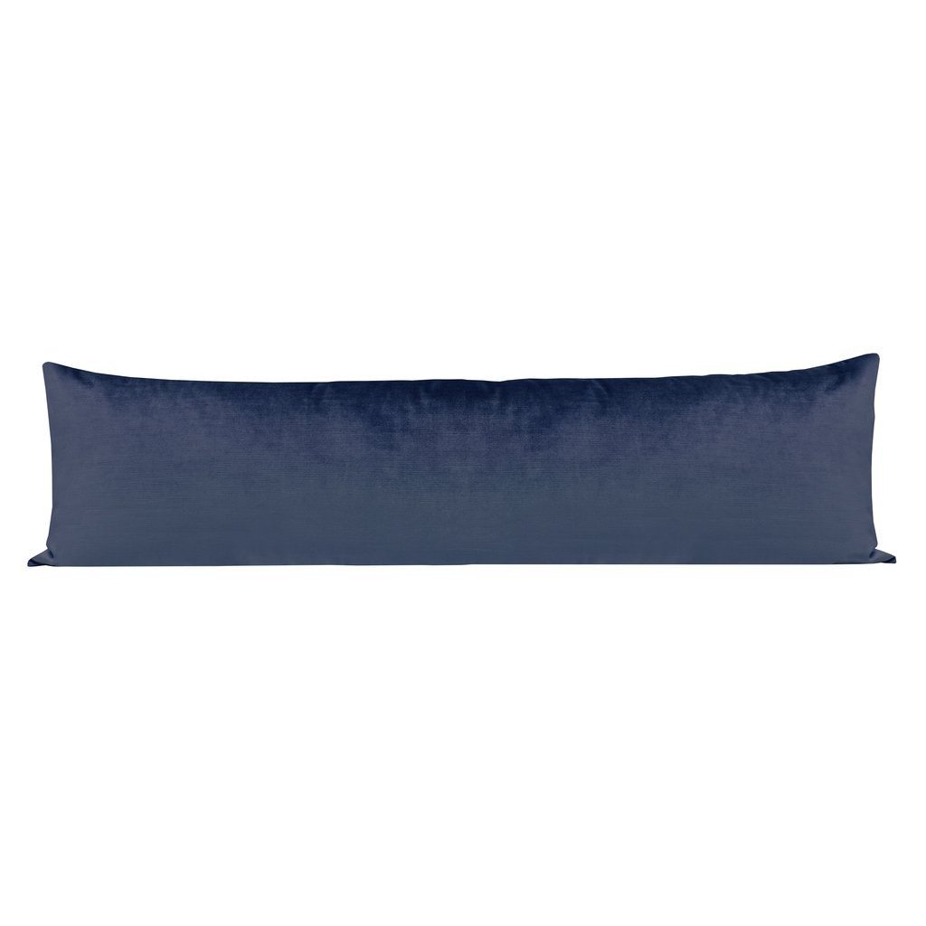
The Columbus nightstands add depth to the room and the pillowscape is to die for. Once again, we used our go-to’s: the Graffito linen pillows and the xl faux silk Prussian lumbar pillow. The Laura table lamp adds a little bit of art-deco flair. I can’t get enough!
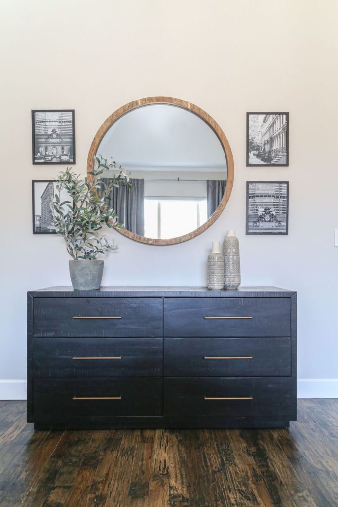
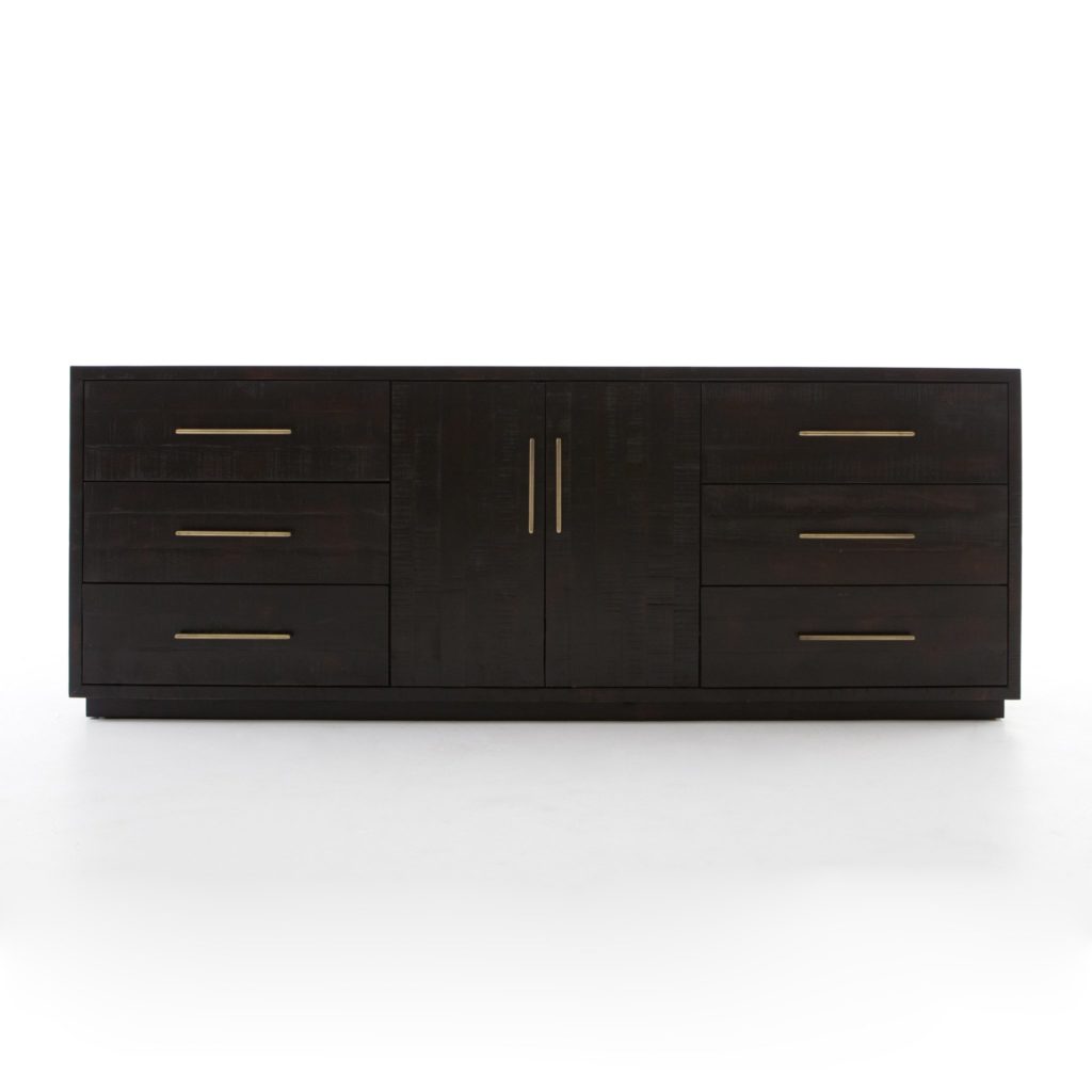
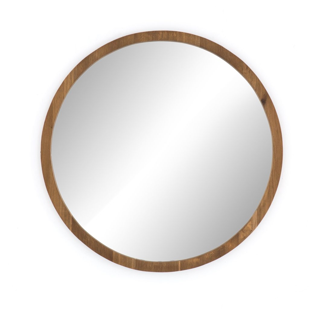
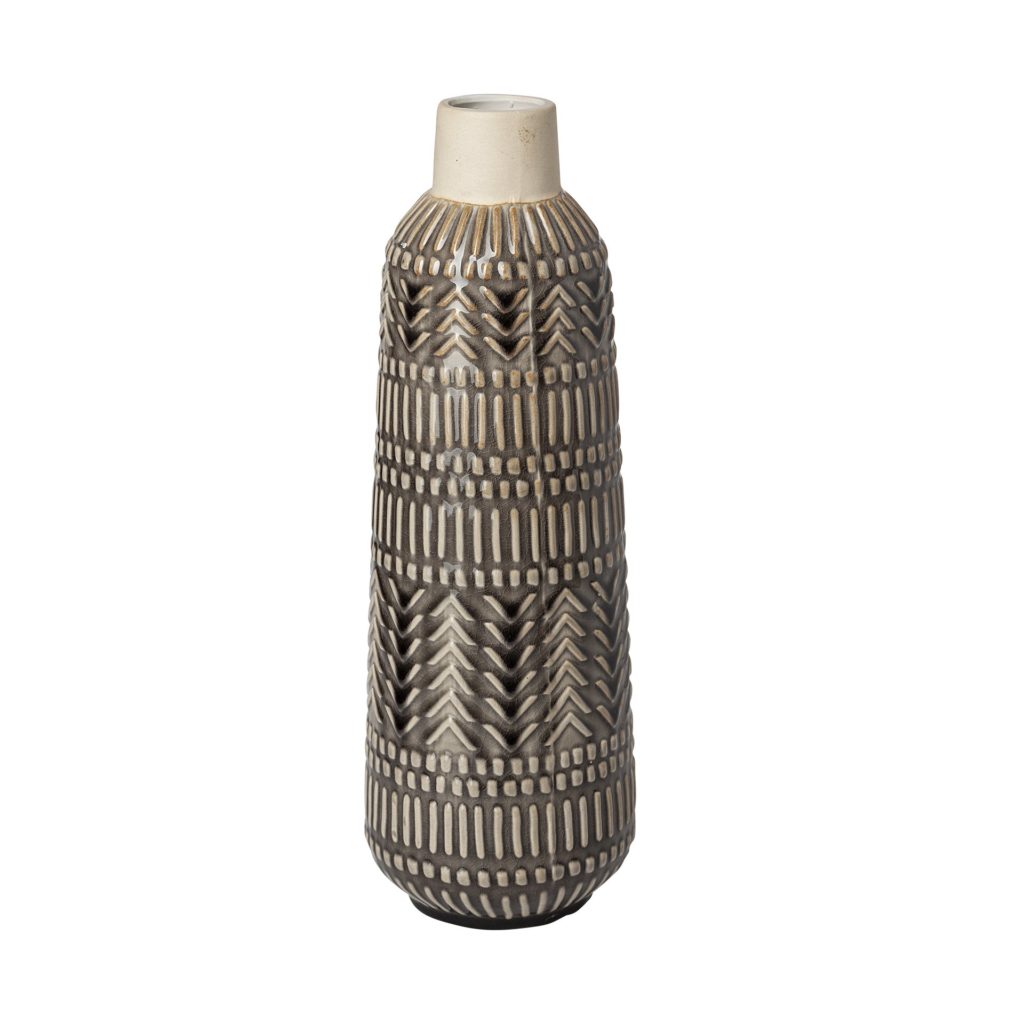
To complete the master, we added this amazing Suki burnished black wood dresser. Love the drama! I sprinkled in some lighter accents with the Holland round mirror and the Riker vases. We brought the black and white prints into this room as well. I am in love with how it turned out!
Outdoor Area
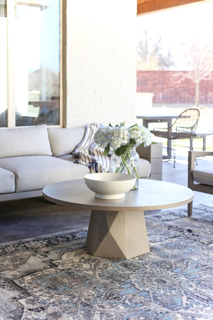
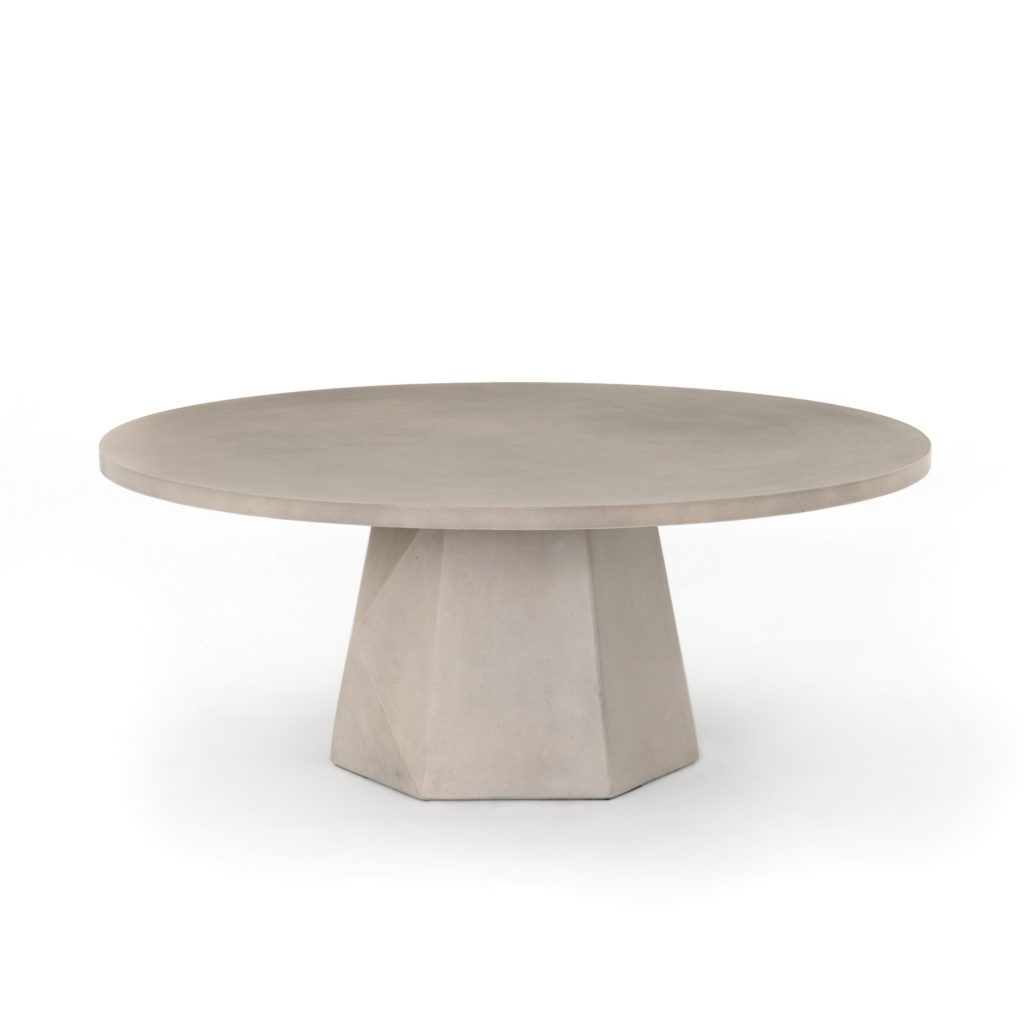
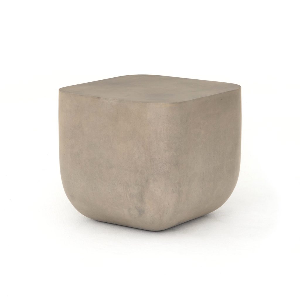
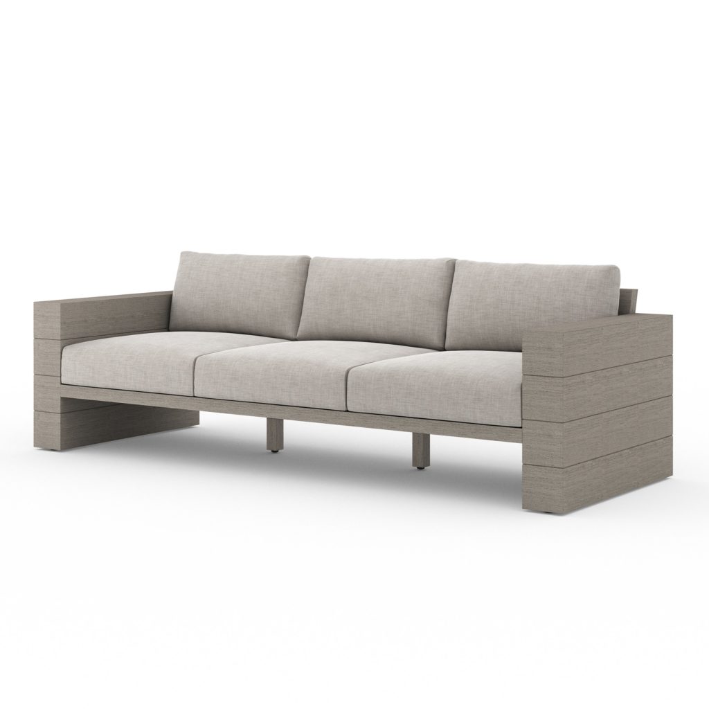
Last but not least in the beautiful home redesign was the outdoor space. I knew we needed to take advantage of the beautiful patio space they had so we added a few CC+Mike staples. The Leroy outdoor sofa and Bowman ottoman bring the indoors out, without sacrificing style or comfort! To keep with the modern lines in the rest of the house, I grabbed the Ivan square end table to finish the look. It’s a space they’ll want to use all summer long!
Project Recap: Guthrie Home Reveal
The Guthrie Home redesign project was such an amazing experience! It was another whirlwind of designs and deadlines, but I couldn’t be happier. I was honored to work with our friends as their designer. Nothing compares to transforming their home into something they will love for years to come! The Guthrie House was another fun opportunity that I had only dreamed of, but the world is full of surprises. Stay tuned for more of our beautiful reveals. I can’t wait to share more!

